Thursday, October 25, 2012

Close up


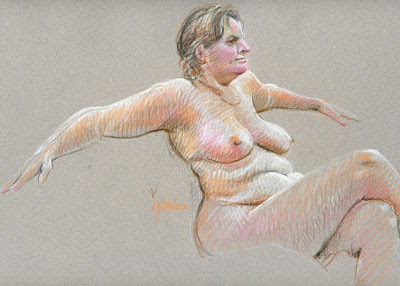
Here is a Prismacolor pencil drawing of a few years ago that might be instructive to examine. In line with my earlier comments about the artist's hand, I mean an examination of this  technique and how easily it can go wrong.

In last week's post we looked at the simplicity of ordinary pencil as a poetic treatment of subject matter. Here in an attempt to show realistic color we have a straight forward  impression of this lady's form, color and character but too much a failure as art. You can see in the enlargement the relatively loose hatching used here, much less precise than that of last week's figures. I don't remember exactly what happened but it seems to me that I'd worked slowly and carefully building up the flesh tones with layered hatching but then, rushing at the end of the session to add those more emphatic darks. While there was certainly a need for some of those darks, the casual way they were done is a distinct distraction.  You can see that most easily in the over-emphasis at the ribs and waist, and in those lumpy lines under her left breast and under her thigh. It hurts! Normally I'd never show anyone this piece but I make an exception here as a teaching tool.   Sorry, there's not much poetry in this image!
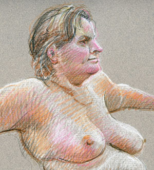

If that had been my intention I shouldn't have paid so much attention to detail and actual likeness. I think now a generalized depiction would have been more successful; why I noted that mole on her cheek, I can't imagine!  Thinking back, I remember a frequent admonition by one of my first drawing instructors, - "Don't be a wrinkle artist!" He wanted us to pay attention to structure rather than particular detail, to study human anatomy to understand what we saw and then reveal that structure by recording the play of light on the figure.  I'm still working on all that!


Yes, I often say be the artist you want to be now!  Think of yourself as an artist and do it now! Yes, do it but know that  as a serious artist you'll be self-critical, always working to improve. I find that saving your work and from time to time bringing it out for re-evaluation does two things. You'll more easily see problems after that lapse of time and secondly, you be able to see your improvement over time.


BTW, You are not seeing the whole drawing even in the one atop the page with legs running off the page because of my scanner's size. The technique of "stitching" separate scans together, while useful, is much too time consuming for our purposes here.


"Be kind, for everyone you meet is fighting a hard battle."  Plato

Friday, October 19, 2012

Simplicity


Some times the simplest approach works best. These straight forward pencil drawings without a hint of color do the job very nicely. They need nothing additional to convey the natural beauty of these figures.  In a way the soft graphite marks may say more,  precisely because of that restraint. Think of a lovely poem or favorite song lyric. Very often a few well chosen words or elegant phrases are so beautifully descriptive they may move a person much more profoundly than a hundred pages. Words are not real, actual things, they are a collection of abstract symbols which with some insight and  organization, are capable of wonderfully nuanced description.

 Drawing also is abstraction.  It may convey the illusion of reality but is nothing but a collection of non-random marks on a receptive surface. Neither of these figures is drawn completely.  The young woman's hands are barely there, the back of her head fades into a bright background yet we understand that she is not somehow disabled or disfigured. The young man above exists here as an arm and shoulder but we accept that he is actually whole in life. We may even make assumptions about his health and character based on the simple stuff we see there.

You, the artist, are a creator of a distinct product.  A room full of expert artists, drawing from the same model with the same materials will produce a marvelous variety of images. Not just because they have different positions in the room, but because they perceive things, process things through a life of previous experience and because they each move differently to make unique marks.  You can see that I, drawing on different days with different people before me, produced two significant images by touching the paper with diverse pressure. These soft images are also quite  different in character from the contour drawings I posted just a few days ago.  Here the emphasis is on subtle gradations in form produced with fine hatching while the other were all about edges.

In the end you will do, and should do, what works for you.  Look and learn and strive for good craftsmanship, good perception, good interpretation but be good to yourself. Keep it simple!


"Those persons who have perceptive eyes enjoy beauty everywhere."  Paramahansa Yogananda

"The abstract nature of reality is the source of beauty."  William Raymond


Wednesday, October 10, 2012

The Shape of Content

I really like this lovely Red Anjou Pear!  I've been painting and drawing pears for a long time,  mostly because of the interesting shapes and color varieties, but also because somehow a simple pear may stand in for me. There is, in this particular pear a quality of real strength, - perhaps it's that marvelous red.  If this piece of fruit were a person, he (Yes, He!) would be a person of integrity, good health, self-assured  and even, perhaps, muscular! (For me, it's peaches that are feminine, but don't ask)  OK, I know I'm pushing it a bit but there is a solid "pear-ness" here in this straight forward depiction. I don't know if you can see it but this painting was not done from a photograph. The original was set up on a solid support, a pile of books if I remember correctly, carefully balanced and lit from one side by my easel lamp and worked on only at night so that the light and color would be consistent. As I advocate looking hard and spending serious time actually seeing,  it's important to love what you do as something important to you.


At the other end of the spectrum are these expressionistic, less reliable fruit, reflections of my emotional state just months after the accident which put me permanently on wheels. No, that is not my uncontrolled hand shaking as I worked, it's my shaken life view spontaneously reflected in my representation of what had been a solid presence. What I'd always relied on in my strong body in all situations is now at best questionable.  Losing so much of ones self is like losing that loving side-kick, the dog who cared for you more than you cared for yourself, the one who sat listening for the familiar sound of your car as it rounded the far corner. Or more pointedly, the loss of a life partner who now gone can never be resurrected. Yes, the world shook and blurred the image that once stood on solid support  - and I reacted in my art because it was totally real, totally there, - a total loss.  After twenty years I can still reach in to touch that moment.


I love the actual act of drawing but in the end the best, most memorable art in this world does more,  revealing something of the artist. The most effective, like the editorial cartoonists Edward Sorrel and David Levine, have viewpoints in which talent, style, craft and character come together in truly unique expression. They really do say something, whether about our world or their's, something that truly touches us.  BTW, I'm not putting myself in that great group, just pointing out the importance of intent and  content in the service of meaning.  You can draw and draw,  love the work itself as I do and produce tons of wonderfully crafted pieces but.... are you saying something worth saying? If Goya were working today how would he view those middle east Drone Strikes?  With Sendak gone who will be the next great children's book illustrator?  Will your next doodle lead to a painting of awesome singularity, - a simple statement that says it all!  An appropriate read here might be Ben Shahn's MIT lecture,  "The Shape of Content"...  if its still in print.  If not it should be!

"Paint what you are, paint what you believe, paint what you feel."
"Forms in art arise from the impact of idea on material..."
"Form is the shape of content..."     Ben Shahn


I think it appropriate to include in this  particular blog-post a portrait done on the occasion of my retirement a few years ago by the wonderful New York Capitol District photographer Leif Zurmuhlen.  Thanks Leif!


Thursday, October 4, 2012

Reclining Kristy


Contour drawing has always been a favorite way to draw. I love the discipline of the carefully observed line and the restrictions imposed by the no erasures rule. In a way it's very easy since it doesn't matter where you start. You observe one particular line in the subject, probably an edge, and draw that single line as carefully as possible. Then finding a line that starts attached to or very near the first, and keeping a careful eye on the comparisons between the two, eg: line direction, length, proportion, you try to reproduce that line. You handle each successive line in the same way so that the drawing grows naturally, organically. If you skip around, a line here then another in some other area, you risk having parts unmatched, out of place in comparison to each other.  Also, notice that some lines start as outlines but turn to run across the figure. These cross-contour lines can be important in giving the illusion of three dimensional form.


If you have never drawn this way in the past, you should approach it at first by paying such close attention to each line that you couldn't possibly look around to make those comparisons. You'll have mistakes at first but it is good practice!  For high quality observation, you should never take your eyes from the line while actually drawing it. Think about that old childhood board game "Operation" where you had to remove the "bone" without setting off a jarring alarm, - that kind of absolute concentration is essential to seeing the unique quality and character of each line.


Once you have the hang of it, then in everyday practice you do have to be aware of the other components of the piece as you go along but the same principles apply - careful observation as you draw. This blue drawing is also a cautionary tale, an example of what not to do!  Here I rushed the drawing of the feet and lost my way. By not paying strict attention to both line and proportion I produced that marvelously misshapen left foot. I then compounded the problem by over-doing the white on that foot, calling more attention to the mistake!  OK, I'm learning!


Now to another subject, - notice the difference in strength between the two drawings. Originally they were quite similar in character. Using PhotoShop I enhanced the first of these drawings to make it show up better and make a better looking, more interesting blog page over-all, a bit of artistic license by the page designer! Increasing the contrast strengthened the lines but in the process we lost some of the delicate character in the original drawing. The second of the two may be a bit weak visually, but it adheres more closely to the original. I think it important that you knowhow visual art can be easily changed digitally, how things are easily manipulated online - both positively and negatively. Just be aware.


"Computers are to design as microwaves are to cooking."   Milton Glaser

"Art is the most beautiful of all lies."   Claude Debussy