Thursday, January 31, 2013

Variations


If this page looks familiar, it's because it was posted for a couple of hours by mistake just last week.  Sorry!

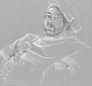
I think I've mentioned the fact that my drawing group has had relatively few men as models but Dan was one who was frequently on the stand several years ago. I show these particular drawings to point out a couple of ways to use white pencil on toned paper and to explore some subsequent creative moves. In most of my drawings where white pencil is involved I've worked with contour line then added white lights. These two are a bit different.

In this first informal portrait sketch the white is used as  reflected light that defines the smooth shiny skin of his forehead and gives us an overall sense of three dimensional form.  This in turn contributes to our comprehension of the figure as "real", standing out from an indeterminate background and acts as evidence of something just out of sight - perhaps light from a window - a contribution to atmosphere or story.


The second drawing is a bit more abstract, more graphic. The over-all "feel" of the picture is softer, more laid-back than the portrait above with its black bristly beard. The white still illuminates the forms involved but rather than necessarily being realistic  we see it more as shape and edge with the grey toned paper doing double duty as background and mid-tone skin and fabric. If we were designing something like a serigraph, a silk-screen print in which color would typically be flat without gradation, this drawing could serve as an initial step. In such a print it could lose some of its soft delicacy but the tension of background vs. foreground would still work.


Here are a couple of variations via Photo Shop: one on the left with increased color saturation, a second with high contrast,  the third with all color removed - just black & white (really grey) variations so softer still.  I could go on with a dozen iterations but suffice to say it's a good way to test the "what if" question before actually doing a second color drawing, painting or for actual use in making a print.
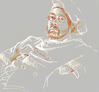


Now, having said all that I realize we are going in a direction that violates or at least bends one of my first principles, the concept of art - drawing in particular -  as hand-made.  You know I always speak of the hand of the artist as an important aspect obvious in the work but once you cross over into reproduction, whether mechanical, photographic or digital - that may not apply at all.
Think about that!


"There is no best way to make art, but there are a lot of better ways."  Darby Bannard

"Art and science have their meeting point in method."   Edward G. Bulwer-Lytton

"The abstract nature of reality is the source of beauty."   William De Raymond


Friday, January 25, 2013

Perspective!

One of the great things about doing this blog through Google's Blogger are the up-to-date statistics provided that help me manage this effort. One bit of information I love shows my viewers' countries.  Nice to know! Another tells me what search words were used to access the blog posts so particular interests are obvious. Lately I've seen many hits around the subject of perspective and since I've not shown any pertinent pieces here in many months, here is one with some comments and explanations. I published the painting below more than a year ago when I wrote about color, light and reflections. I show it this time because it is a good example of a couple of basic perspective ideas.

The most basic idea in perspective is the concept of overlapping shapes. -  an object overlapping another is closer.  Picture two squares of cardboard, one overlapping the other.  Starting with the group of trees and bushes on the right edge of the painting below, you can see a series of overlapping planes, like stage scenery moving back toward the far sky. Trees, then bushes, next a house and another, a stand of dark trees, etc.  Simple, right?


Another important concept is aerial perspective, - the fact that atmosphere interferes with light transmission so that the further back in space, the less distinct are objects and their colors. You can see this most obviously on hazy or foggy days.  If you were making a painting or illustration, working in the studio rather than observing a scene, you'd plan stronger, brighter and/or warmer colors forward,  with cool hazy dull colors toward the rear.  Compare the far steeple and trees with colors closer in this view. 


When people speak of perspective they generally mean one or two-point linear perspective.  In this painting we can see that things like the retaining wall and the creek bed both recede in an orderly way, getting smaller as they move back from the picture plane (basically the painting's surface) toward a point on the horizon.  The basic rule says, lines parallel to each other and parallel to the ground run toward a common "vanishing point" on the horizon.

Think of the far horizon on the western plains or the ocean, not the place where sky meets a mountain.  In a picture like this that horizon is obscured by trees, houses and hills so think of the horizon as your eye level.  It is! The painter's eye level in this case would be a horizontal line across the picture just below the top rail of the bridge. In the painting you can see a white rectangular trash bin.  It sits parallel to the wall and creek. If you drew lines along the top and bottom of that box front, and the top and bottom of the wall and the sides of the creek -  and extended them back in space, all would run toward the same vanishing point.

BTW, the term "one-point perspective" refers to the common vanishing point for parallel lines, not that there is only one vanishing point in the picture!  Various objects  sitting at different angles would result in a variety of vanishing points.  We can address that topic another time when we talk about 2-point perspective.  In one-point perspective other parallel lines like those of the bridge and the walls of houses facing us are always drawn parallel to the picture plane.

So....  Colors fade with distance! The horizon line is your eye level!  Parallel lines run toward the same vanishing point!  Got it?


"Perspective should be learned - then forgotten!"   Nathan Goldstein


Tuesday, January 22, 2013

Flemish dress drapery

Just a quick extra post this week!  I came across this drawing of a young Flemish woman modeling a lovely dress for us.  If you think back to last week's post I talked about the problems of understanding folds in the drapery of clothing.  In that post I recommended exercises like dropping cloth or crumpled paper on your desk then copying / comparing  the creases and folds you see.


I swear this Flemish artist did exactly that but then he added the woman's figure as if that cloth drape were her dress!  Doesn't it look like that to you?  I used to draw lightly crumpled paper then turn it into a craggy landscape with added trees and more carefully defined rocky cliffs.  That worked for me and I'll bet it worked for him!


(Kneeling Lady, School of Hugo van der Goes, 15th century)


Thursday, January 17, 2013

Rembrandt and Crumpled Paper


Here's a lovely little Rembrandt drawing! Look at how beautifully this woman's clothing fits her body. Check the drapery of the skirt falling so convincingly from her waist.  See how her bonnet really fits on her head!

Now, let me revise those words just a bit. -- Look how Rembrandt shows you the body's form so beautifully. - how he renders so convincing the drapery of her skirt, - how that bit of shadow he added on her bonnet shows us the cylindrical form, even hinting at the bulk of hair beneath.  I'm just pointing out the fact that there's a person, an artist doing the "showing"!  A person who at some point in his life couldn't draw that well!

I'm stating the obvious when I say Rembrandt was an absolute master!  When not working on commissioned paintings he spent hours drawing the people around him or just as likely sat alone drawing his own face by candlelight. He drew constantly!


Here is a section of a drawing where I worked to reproduce the folds and creases of the model's shirt. Aside from the fact that I am no Rembrandt, one reason those folds don't have the strong three dimensional qualities his do is the lack of light and shade, his trademark in his drawings and  paintings. There is some sense of form in mine because those carefully recorded lines describe over-lapping shapes but compared with his, these drawings still seem a bit flat.  (I almost said, "fall flat" but I don't want you to think I reject these drawings.  I like working with line. I value that simple aesthetic.)

You can see another thing going on when you compare  with the grey cloth drawing below.  I copied as closely as possible the edges and folds of the shirt's fabric  and while I did a somewhat similar thing with the lines of the grey cloth, I added both lights and darks on the mid-toned paper.  This expanded rendition gives us a lot more visual information so we comprehend the form much more easily.


I've zeroed in on folds and creases  here because it's one problem we often face as we draw people. Yes, if you look at clothing carefully you can interpret wrinkles fairly well but as with human anatomy, it helps to understand the anatomy of draped fabrics. Toss a piece of clothing over a sharpe edged object and look at the way it settles itself. Drape it in various ways. Do it again and notice the similarities in the folds from one "toss" to the next. Try different fabrics, heavy and light, then make comparisons. Do some sketches. Do some more!


Another quick exercise is to very lightly crumple a piece of paper and draw it in different views. Crush a few more sheets: one lightly wrinkled, another more heavily. Crush one then unfold and gently flatten it. Draw these using your favorite medium but don't be afraid to try different ones like hard & soft pencils. conte crayon, charcoal, - even pen plus ink wash as our good mentor, Rembrandt, did above but really, --  Just draw!


"Aim high and you won't shoot your foot off!"   Phyllis Diller

"There is only one proof of ability - action!"   Marie von Ebner-Eschenbach


Thursday, January 10, 2013

Give her a hand!


This nude done several years ago, is one I really love! It has great color, an almost tangible sense of three dimensional form and a very real personality there in the model! When I found it in an old portfolio just now I wondered why I hadn't used it here it in the past.  Checking back, I did find that I'd done a post with what I believe is same model but in a completely different pose, - not this drawing.  So, what's not to like?

It didn't take long to find the problem and I'm sure you've found it just as quickly! Her lips, breasts, knees and even her nose has that strong form I just spoke of.  The feet, even though lightly outlined, are acceptable because we understand them to be barely sketched in place.  They "read" well!  No, it's that wimpy hand! The right hand is bad enough, hanging like a limp fish with little delineation but look at that poor left hand. What a disaster!
Hands are not just a problem here but a very real and common problem that frustrates many an aspiring artist!


Hands are probably the most difficult part of the human body to draw convincingly because they are so articulated and flexible.  This difficulty is especially true when, as in the left hand above, the distortion of foreshortening is involved.  I remember fighting with it, trying to make myself believe it was a solid live hand rather than a flat and empty glove. At the time I just couldn't see it any differently.


I often redraw details of pictures when I have problems. I was doing a pencil portrait of my aged mother when I realized my rendition of her hands was not working well at all. I did these additional sketches  trying to understand the particular characteristics of her hands - the enlarged knuckles in crooked fingers for example.  This is one of those instances where some knowledge and prior practice would be useful!  It's really back to the books time!


I've often had students who thought it my duty to teach them "how-to-draw" what ever their current interest was whether cat, dog, horse, super hero, or anything.  If you have been following this blog for any length of time you know my emphasis has always been observation, "learning to see",  so what-ever your particular subject, even something unfamiliar, you'd have some success in drawing it.  Beyond that, research is the answer.  When confronted by a problem like the hands above, check out a basic artists' anatomy for realistic depictions of bone, muscle and ligature relationships then go to a good "how to" volume for diagramatic construction tips.  Between those actions and some quality observation,  you should be (and I should have been) able to draw an observed hand in any position.  (Still, that foreshortening can be tough!)

Yes, if you have a particular interest, do some real research, get to be the expert so that your work is understandable, unified, interesting to look at and interesting to do. I often talk here about the importance of observation and at times even preach acceptance of distortion in your drawings BUT context is important!  The whole drawing, the whole figure in this case, should meet the same basic standards and the drawing of the lovely model above clearly misses the mark in that left hand.  Mea Culpa!


"Difficulties come not to obstruct, but to instruct."   Brian Tracy

"When I see nature I see it ready-made, completely written - but then, try to do it!"   Claude Monet

Thursday, January 3, 2013

Cat Sketches


Here's a happy selection of cat drawings for the New Year!  These are all of our handsome boy Squeeks, a brown tabby, some from when he was just a little kitten with a tiny thin meow, hence the name.  He's been with us for quite a few years now, doing his best to take care of the other two.  One, who would be a mess without his ministrations, the other young "Black'ins" too very aloof and independent to submit easily to his attentions.  It's his "job" and he works at it! 


Someone mentioned I'd been showing a lot of figures lately and since I've not posted either cat drawings or hatched/textural pieces in quite a while, thought that these might make a nice change. They are a change also from the spare contour line I've been emphasizing with the figures. The first two are ink, using my favorite #3 Staedtler Pigment Liner, while the two kitten faces on the right are soft pencil but handled very much like the others. In all, the hatchings mostly follow the contours of the cats body, mimicing the direction of the fur. Just putting the short lines close together gives the illusion of shadow, shading and therefore a sense of form. Tho' a bit softer in pencil, the techniques work the same in all. Close lines and cross hatching for the darks, wider spacing for the lights. Amanda Palmer, with her ukulele, has a song where she urges us to approach art as being easy. She's most likely talking about music but I think it's good advice for us!  Yes, work at it, look carefully, but make sure you enjoy the effort and it will really seem easy! Enjoy the subject and it's even more easy!


When it comes to drawing cats, unless you are extremely fast, about the only way you'll have easy success is to catch them sleeping. A try last night had him moving at every little sound and trying to catch the pencil, - a complete fiasco!


"Do at least one sketch each day and you'll sleep like a kitten each night."   Harley Brown

"Thousands of years ago, cats were worshipped as gods. Cats have never forgotten this. "