Thursday, April 26, 2012

Sunday Comics!

Some of my happiest early memories were of sitting at my grandmother's wonderful claw-foot oak dining table perusing the Sunday comics. I liked the simple color shapes in strips like Captain & the Kids, The Little King, and Jiggs and Maggie. They were very appealing to my young eyes. Neither the gorgeously drawn Prince Valiant or Flash Gordon held much interest for this beginning reader, probably because of the complicated story-lines, the way the story continued week-to-week and the un-reachable (to my mind then) much too realistic art.


I wanted my fun straight up and to the point!  Lil' Abner, Krazy Kat and Smoky Stover,  (the last two vaguely surreal) were added a bit later. Even later in my high school and college years were Pogo and my "discovery"  Winsor McKay's truly surreal "Little Nemo" which had been first published a full generation before my childhood comics reading days.

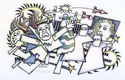
I love comic art, whether daily paper strips, simple TV cartoon, or today's delightful digital stuff, - so it's no surprise that one aspect of my sketchbooks reflects that interest.  I've shown some related things like my "Talking Heads" and "TV Games" posts earlier.  Now, here above is a piece done while listening to a public radio broadcast about the cost of phone-calls from prisons and jails, while coincidently receiving a funny "crank" call from a friend.  The drawing was done as the story unfolded, basically left to right with no plan or advance knowledge of the subject.  Some things had to be rethought, changed mid-drawing but I coped!  The second drawing, done in the same way, was a response to the Shock & Awe attacks on Iraq of a few years ago. There are others.  I love the challenge of designing a drawn response "On the fly ".  For me this is the very essence of creativity,  an end and a beginning!

These drawings certainly stand on their own but could be developed or expanded to fill any material or media need.  Right?  Actually, the images you see here are prints!  The original B&W drawings were scanned, digitally printed and hand colored with my ever ready Prismacolor Pencils.  I think they'd translate well as wood block or linoleum prints too,  - or any of another dozen possible directions! Sometimes you never know where a "Doodle" will lead.

Hey, if it's your work, your art, - you choose! -  It's yours!  Enjoy!


"Oh, Magoo, you've done it again!"   Jim Backus, voicing UPA's Mr. Magoo

"Recall it as often as you wish - a happy memory never wears out."  Libbie Fudim

"Sometimes the sweetest choice is choosing what you already have."  Jeff  Davidson

Saturday, April 21, 2012

Self Image, Drawing


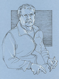
O.K. Fair warning: This post is all shameless self promotion!  These drawings are a group I did one day a year or two ago as I sat in front of a mirror admiring myself.  The one on grey paper was first and I initially rejected it as showing me as too tough. Tough guy?  Yes, strong steely eyes and steely strong jaw set against a steely grey background vs. an unsympathetic multi-hued world.  (The story of my life!)  A stressful day drawing went on and on and I was forced to deal with paper of more emphatic colors.  I'm sure I became more and more tired.  I certainly see some sequential sagging in the body from first to last, - grey-to-orange-to-blue.

There are some good things here.  I am happy with the hands in both blue and orange versions. These are not generic hands but  are particular hands in typical "Me, Drawing" positions.  At first I hadn't considered the expressive power of the hands so allowed them to hide in the sketch-book pages on my lap and thereby lost an important aspect of myself, - the fairly famous steel-nerved artist hard at work. When I realized the mistake I made sure to highlight them in subsequent drawings. Much better, yes?  BTW, I do not know how to draw hands from memory - they are really difficult, - but I do know how to look and see edges as lines, one after another making up the complete hands.   (Tho' not in that nice (sigh) grey version!)  Actually, I'd guess a combination of the three poses could add up to a fairly accurate portrait. (1)  Grey = the competent broad shouldered artist, earnestly involved in the job at hand.  (2) Orange = the experienced craftsman, a bit more introverted but ever ready with strong sage advice.  (3)  Blue = the bone tired artist guy, hoping to avoid confrontation and put the tough day behind.  You can call me after my nap!

Yes, I was kidding, mocking myself as I wrote above,  (See the "Tongue-in-cheek" grey paper pose.) just having a bit of fun.  Friends and family kid me about my penchant for grey clothing, saying I'll wear any color so long as it's grey! - it's all a lie!  I occasionally wear dark blue or a dull heather green.

So, what am I saying, seriously?  Contour drawing is lively art!  Direct drawing without an eraser in hand keeps you on your toes!   It's like going out sailing in variable winds, - you are constantly having to adjust to wind and wave while keeping your eye on the compass.  In life "stuff" happens.  You may not move through the day / month / year quite the way you had expected, so you adjust.  It's the same in contour drawing!  The line may stray some as you work, you make adjustments and make it work, as I did above.   I often say, "Work hard, look hard, etc." but retain your sense of humor, -  enjoy yourself too!  Relax, have fun and then the hard work, the serious preparation may morph into a creative moment.    Researchers often emphasize those steps to creativity,  ending in a new way of seeing things.

(Strangely enough, here in these most recent drawings I look older than in any other published drawings.  I've just checked the mirror and the causes are obvious.  I'm certainly more tired lately and not drawing quite as well as I usually do.  My eyes have been giving me problems,  the arthritis is stiffening my fingers and no doubt... my sneakers are too tight!  There are always excuses. Just stay at it! Let the variations happen and they may lead you to better concepts. Look how handsome I am on the grey!


"The essential ingredient for creativity is wasting time."  Anonymous

"Creativity can be described as letting go of certainties."   Gail Sheehy


Monday, April 16, 2012

Rendering Form


These drawings came out of an old sketchbook and form the "secret story" of three (Yes, three!) poses by one model done at different times. 

The  nude was done more than a year before the clothed figure. It's a similar pose, - but that's not the secret here.  The connection between the two is that the common purpose of both poses is to show the "form" of the figure, - to see the figure as a solid.  We know that lighting plays a part in our perception of form, but we should be aware of the figure as a series of solid "cylindrical" forms and  curved surfaces.  On one hand a sense of volume and weight, on the other, light and shadow on surfaces.

The clothed figure is actually two separate poses, one done "nude" then a week later the model returned and donned that simple dress for a second session in the same exact pose. It's not a whole new drawing, the dress was added directly to the nude drawing.  It's really a learning experience!  It shows us that having knowledge of anatomy is a plus whether  gained  through study or through observation as we did here. 

These particular drawings are very different from the majority of the figure examples I've been posting.  Here the emphasis is on accurate drawing, good proportion and most importantly,  using shading, shadow and contour lines in rendering "form", - the 3-dimensional  aspect of the figure.  BTW, I remember being very happy with this clothed figure when I'd finished it,  but we can see now there are a couple of proportion problems, - the head a bit large, the hands somewhat smaller than they should be.  I am, however, happy with the way the dress hangs on the body.  There's a sense of weight in the fabric draped on solid shoulders, breasts, knees and thighs.  If you look closely at the nude on the right, you can see lines drawn around the bulk of the thighs. These contours enhance our understanding of the form and the shape of the surfaces. If the model's dress hem had lain on the legs at that level, we'd see how the limp edge would follow that line, the surface contour, across the top of each leg then dip between the two.  Look closely, draw carefully, pay real attention to form.

"Form is the shape of content."  Ben Shahn

"Drawing is your understanding of form."   Edgar Degas

Wednesday, April 11, 2012

Two Points


These fantasy "insects" came out of nowhere about thirty years ago as I sat doodling, - an automatic drawing started without idea or plan.  I put down a few lines and it just grew! My sketch books at that time were a venue for exploration and introspection, quite a bit more creative than many of my present doodles.  Most of the things I do today are based on observation, the subject "out there" somewhere, the art dependent on my ability to see. A good part of drawing ability IS the ability to see but sometimes (or some time) you (may) want to SAY something! This point was made during a master's critique by an insightful teacher who said, "O.K., you can draw. So what!"  It was time to sit down at the drawing table and get to work.  That time is here again.  


The drawing was done with the Rapidograph pen I spoke of a few of weeks ago, - a fine technical pen that I used in my drawing for many years, with some small added color.  The partial scan detail here on the left, larger than actual size, gives you a good idea of the variety of marks that help make this an interesting piece. One of my long held "rules" is that a work of art (at least my work) should be interesting at a distance and up close. Depending on the particular piece, "at a distance" could be anything from arms length to across the room. "Up close" referring to the work itself, - the pen stroke, paint stroke, what ever the natural mark of the chosen instrument might be. Whether the subject is emotionally charged or cool observation, the viewer should find the artist's "hand" engaging, instructive, - interesting in itself.      


          "Every artist dips his brush into his own soul, and paints his own nature into his pictures."
           Henry Ward Beecher

BTW,  Someone asked recently, where I find the quotes for this blog.  I subscribe to "Robert Genn's Painter's Keys" a free on-line art newsletter which features a listing of art-related quotes.  I love it!


Sunday, April 8, 2012

Factory Work


In this post we approach drawing this old factory in a "different"way. It's painting first then drawing! the reverse of most artistic progression. There's nothing wrong in using reference  when you cannot access the subject or when your purpose is to be creative. Commercial work often requires research and reference. I do some local sketches for my paintings, take multiple photographs, and use both as the basis for painting.  In this case, when finished with the painting, I sat down (sorry!) and did this quick drawing while looking both at the painting and the photos. (BTW, this drawing has become a digital print. Look below the drawing and you can make out penciled signature, title and edition number) You certainly can see the photographic
derivation of the painting but for me,
the drawing/print has more life,
more personality.

I think the next step might
be to repeat the painting but this time using the drawing as the design format and the first painting as color reference and/or point of departure. Truthfully, because I love making art, I'll use any method that gives me motivation. Using your own work as reference contributes to continuity. Your work looks more and more and more like "Your Work"!

Learning to draw well requires patience and application but you should  have fun while you are at it. Fun, for me, means having problems to solve.  Set up your work with variations, even if it's only different choices of color, change of viewpoint, purposeful distortion, or a different medium as I did here. You can learn a lot by redoing each idea at least once.  Re-solving the same problem has real benefits!

"Don't be too proud to repeat yourself."  Robert Levers

"A mere copier of nature can never produce anything great."   Sir Joshua Reynolds

Thursday, April 5, 2012

Real Ladies

"These drawings are quite different from most of the figures I've been posting here lately.  I tend to emphasize edges and line rather than form and color. Where these are somewhat more subtle, much of my sketchbook action is more graphic.   Those in the last post were almost cartoons.  (Yes, I do like cartoons!)   Adding highlights to what is basically a line drawing can produce a nice illusion of form,  but here I'm doing a bit more to strengthen that illusion, - giving attention to the subtleties of shading and color.  This is not sculpture where the stone or clay is essentially a one-to-one three- dimensional copy of the original figure.  A drawing is an abstraction so the line, shape, color or shading on paper are approximations at best.  It is all illusion.


Just as the writer chooses her words, you the visual artist must make choices. - First about materials like paper and medium,  then about the marks and the quality or character of those marks.  The combination of materials you choose, paper texture, the pressure you put on the instrument,  the line character and the color all bear on the results. Fine or coarse line, light or heavy pressure, strong color or perhaps so subtle it is hardly there.  In the end it is your creation, your artistic statement.

These three small pieces are my usual  Prismacolor pencil but on Borden & Riley #410 Grey Pastel & charcoal.


Beyond materials you must  also decide how much you want to say.  Do you want to show everything you see or know about the subject?  How much detail do you need? Do you think it does all you want it to do?  Is the work like prose or poetry?  Is it just a "picture" or is it a work of art,  where your hand, your point of view, your sensibilities are at least as important as the subject.  Is it something that you'd be proud to show others, - but more to the point, do you like it and truly enjoy looking at it.


"The subject is a means to an end, the end being excellence in artistry."  Theresa Bayer

"The beauty of poetry is that the creation transcends
 the poet"  Mahatma Gandhi