Thursday, December 27, 2012

The descriptive line


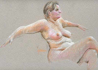
I've been looking for an excuse to feature this  drawing for a while!  It is for me, a particularly successful piece done in the same simple contour mode that I've shown in the past.  This is a drawing method which depends for it's success on very careful concentration as you work. In working this way each individual line has to be treated as if it is the most important line of the whole drawing. Once it has been completed, the next line is the most important one!  This is not a "sketch", nor a drawing which can be treated with any kind of off-hand manner. You must pay complete attention! Look at each line of the subject, analyzing its distinct proportions in relation to itself and in comparison to the other elements of the piece. Take your time!

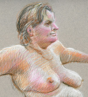
I don't believe I've spoken about one other important aspect of line in the past.  Altho' it is a single line, the crucial idea is the use of varying pressure to emphasize the importance of particular line segments, e.g. to signal a change in direction or to high-light important shadow areas without actually adding shadows.  Aside from that, an interesting aspect of the line in this case is to put emphasis on the ends of the line especially where it intersects with another   Look at the lines delineating the hair. Each line starts out strong at the forehead and temple then fades, helping us to see form in the mass of hair.  You can, if you wish, add the emphasis to particular lines after the initial line is drawn or after you have finished the whole drawing.  You can use the same color or one slightly darker or a bit more intense as I've done here. (As noted in the past, the added white enhances the 3 dimensional aspects of the subject.)

A third important aspect of the varied line is its contribution to variety within the drawing. Variation of line weights helps to make a drawing more interesting . The viewer's  attention to these varied line weights slows his progress as he scans the work, adding to his pleasure by following your actual work in making the drawing. As you produce the drawing you teach the viewer about drawing, unity (harmony) in the drawing design and the importance of careful observation, whether in the initial work or in viewing the finished piece!  Not just an artist you'll be, but a teacher!


"Repetition and variety create unity. "   Virginia Wieringa

"Get to know the subject intimately... by (looking) and learning from nature."   Melissa Jean

"To teach is to learn twice."  Joseph Joubert


Thursday, December 20, 2012

An Alternate View


Perhaps you've noticed that I haven't posted many drawings of men on the blog. (I can hear some saying, "No surprise there!") Part of that is the fact that we have had far fewer men as models than women. The other factor may have something to do with my preferences, so here, to make up for my "disorder" is a male portrait I particularly like.  Steve is a strong guy with a great face that I have been drawing for years. This color pencil portrait in 3/4 rear view, is an angle I run into frequently when out drawing people in doctor's offices, auto mechanic's waiting rooms, car washes, etc. The nice thing about this angle is that people don't notice you working. You might be surprised by the way people get nervous when they realize I'm drawing them, so any near-rear view helps mitigate that problem.  I have to say tho', there are some who do get a kick out of an artist paying attention to them!  It's another of the real joys of drawing in public.


The larger satisfaction in working in public is "getting it right".  You have to look fast, work fast to catch the pose before things change., - and change they do!  I hold my breath when I hear a name called, hoping it's not my subject being told his car is ready! I have too many sketch-book pages of partial figures I've had to abandon. As you can see I generally work with pen in public, a deliberate choice so I'm forced to look very carefully as I draw. No changes, - it's great practice!


When I checked my sketchbooks looking for subjects turned/facing away to match Steve's pose, these two turned up - just coincidently guys bald or near-bald as Steve.  See, things sometimes do work out to produce balance without any real planning! (I wouldn't bank on that tho'!)


And speaking of symmetry, here is a second drawing of Steve to round out this page and to let you see him straight on, - nice face but a much more mundane view. Aside from the privacy it allows, that 3/4 angle I love is also positive in adding to my scant knowledge of anatomy,  especially with those bald heads! How often do you get to study skulls, cheekbones, chins and ears from this angle?  Go for it! Enjoy the view!


"The joy is in the process, not the product."  Fay Bohlayer

"Skill is less important than awareness."  Graham Collier


Friday, December 14, 2012

Frustration!


Here are a couple of the latest Kristy drawings, both worked up much more quickly and more loosely than most others shown recently. The one on the left was finished in just a couple of minutes at the end of a frustrating two hour session in which I'd only produced one poor drawing like that on the right where correction after correction muddied the result.  Look at those overworked and unnatural eyes!

Yes, there are some interesting areas like that right hand where the history shows, but in the end my heart or head was not really in it.  Sometimes you just have to admit you are having a disastrous day, pack up your pencils and flee for the hills ... but most times taking a deep breath and starting again is really the right idea!  It's a rare artist of any sort who doesn't feel undone occasionally by the frustrations of time, technique or technology! Working hours to produce a wonderful image and losing the whole thing to an over eager misstep or technical mistake is truly "the pits" but backing up rather than packing up will build your resolve and strengthen your love of drawing itself.  The old dictum "Ninety percent of success is just showing up" is really the right idea!  Even as I peck away working toward this latest blog post, I often wish I were just drawing instead but ...  I slog (and blog) on!  Hey, just do it!


"Be gentle to all and stern with yourself."  Saint Teresa of Avila

"Better a diamond with a flaw than a pebble without."  Confucius

"What comes out of you when squeezed is what is inside of you."  Dr. Wayne Dyer


Sunday, December 9, 2012

Looking for Comments!

This is an interim post with no new art image! I'm looking for comments regarding this art blog! I know we have quite a few regular readers (or lookers!) around the world but most remain completely anonymous! Historically this blog attracts between five and six hundred hits per month. The current number is higher than ever at 668 in the last four weeks! Those hits are from many countries around the world led by The United States, closely followed (this month) by the United Kingdom, India, Russia, Canada, Australia, Germany, Brazil, Philippines and Israel. I believe every single country in the world has brought at least one visitor. My problem is: I really don't know who you are, what brought you here, what you see or read here that keeps you coming back. I rarely find comments left. (Perhaps you need to be a "Follower" to do that?)  So how about some communication focused back in this direction? If somehow you cannot use the comment box, email me at < pspaz1@yahoo.com >.  I'd love to know where you are, something about yourself and what you find good or useful about my "Dailies" posts? Do you share, forward or recommend these posts? Are you a "Follower?  (I'd certainly like to see more of you on that list!) I really look forward to reading your comments! Thank you!

Friday, December 7, 2012

Form and Material


A previous post spoke of simplicity and showed a penciled beech tree drawing that I really liked. I thought it would be good to post more like that just because of the spare approach. I also thought, except for that recent one, that I'd shown too few trees lately so went through my files and found a real surprise, - No Trees!  Well, at least no more in pencil.  I must have been into pen & ink for a lot longer than I thought, - plenty of those! Among them, these great old maples, two of several bordering the drive of a wonderful Maine B&B where we vacationed many years ago. I spent a couple of hours in soft summer shade picturing these two aged guardians with a very fine pen. I didn't draw the horses eyeing me from the fenced pasture beyond but they were a lovely addition to a productive afternoon.


Without a tree in pencil, these graphite gloves, preliminary practice for a planned series of twenty years ago, will do to compare the natures of the two media, - the thin hard line of ink vs. the broader soft graphite.  I'd finished a couple of the series pieces when life got a little hairy and I put them aside to make room for recovery.  Neither of those is small enough for inclusion here but no matter, the pencil in this drawing is just what I wanted to present. The work is loose enough to be interesting and well enough controlled to describe the subject.

Looking back now, I wonder how I would have handled those trees if I'd had a pencil in hand rather than a pen.  Ink certainly can be looser than that above but still, today, I gravitate toward the simpler pencil drawing where the few details are nice contrast in the supple surfaces.  The penciled glove drawing is more abstract, so more contemporary and shows a better appreciation for form. The trees are an example of a tight working method I used for years, - nice in its attention to texture but now somehow "dated" in its fussiness.

Each of these materials have positive aspects. Work with both, either, or any other you find interesting.  Work with media you truly love, explore its breadth and become master of its depth!


"Every master knows that the material teaches the artist."   Ilya Ehrenberg

" 'Scenes' are temporary; form is eternal."   Lynda Lehmann


Friday, November 30, 2012

Integrity


Finally!  We have solved that Google site problem but now being late,  I'm publishing just a short post this week. It is this latest Kristy drawing. Look how lovely it is on my favorite grey paper!  (You have to know that friends and family constantly kid me about my love of grey!) Yes, you might think it was rendered that way but actually the original is the multi-color drawing below.  I thought it interesting to scan the piece in both original color and also in black & white. Now I think I like the grey better! In comparison the color piece seems scattered, less coherent, without unity. Hey, perhaps there's a lesson here! Think about keeping it simple; complication for its own sake, whether in form,  technique, composition or color might be confusing and self defeating. Think about repetition; the idea that gives an art work harmony and contributes to its integrity.


In our last post I showed how increasing the contrast in a soft delicate drawing using photoshop adds strength so that the work shows up better on the blog. Here now, is another way to enhance a published piece using PhotoShop.  Not bad - but If you are going to do something like this, I believe you should inform the viewer! You wouldn't want to mislead anyone by electronically enhancing your work, making a person believe your work is something other than what it actually is! Just from a practical standpoint, - you certainly wouldn't want a potential buyer to come looking for a work that doesn't exist!  It's hardly good salesmanship nor good customer relations.  Maintain your integrity!


" ... where harmony is concerned, more can be achieved with less color"   Scott L. Christensen

"The hidden harmony is better than the obvious."   Alexander Pope

"The elegance of honesty needs no adornment."  Merry Browne


Thursday, November 22, 2012

Praise Nature


This is a tree I drew just yesterday. I was wandering through our nearby NYS Saratoga Spa park, in an area I'd previously explored, when I came upon this beautiful beech tree. I'd actually taken note of it a few years ago but its existence had slipped my mind. I parked across the road, retrieved my ever-ready sketch book and went to work.

The drawing below was the result but in scanning it for the blog I found that the light pencil strokes didn't reproduce well. For some reason they seem just a bit out of focus. At least that's the impression it gives. I tried several times with the same result.  I've noticed the same problem in the past with a particularly nice ball-point pen drawing which to my eye is perfect but the scan is truly less than lovely!


So that I might share the drawing here, I opened it in PhotoShop, upped the contrast (probably a bit too much) so that now it shows up very well!  I really love the delicacy of the original but, alone it would have been a complete dud here on this blog. You can see yourself that presenting the two images gives us a more complete picture. I hadn't thought of that before, but I like it!

Now with the stronger image in place, I see another little problem!  Can you?  About 2/3 of the way up the tree on the left side, my eye is drawn to an unfortunate accident, - not one of poor observation of the subject but one of poor oversight in execution. I'm usually very conscious of the shapes I draw, including the shapes of the negative spaces created. There enclosed by, delineated by a couple of small branches is an almost perfect circle among all the odd oblong and triangular spaces!  It's the kind of feature that once seen is difficult to ignore - something like finding a face in clouds or leaves -  it calls attention to itself and interferes with our appreciation of the total drawing.  Looking very closely with some magnification, I see that one mistake was in failing to fill in the hatched shading in that part of the heavy main branch that forms one side of the circle.  Flattening that side of the circle will render it less attractive to our eye but adding a twig to break the circle may still be needed.  While creating lovely things, do be conscious of inadvertent moves that may detract from that beauty.

All that being said, there is something truly satisfying in looking at trees. They are another natural set of forms displaying enough variation between individuals and within each individual that the observation is always interesting, - wonderful shapes, great form, nice structure! When I speak of observation, you know I'm referring to drawing, the best and most intense kind of looking!  The visual knowledge gained and then presented by the serious draftsman is golden!  The image the artist presents to the viewer is often more informative and more interesting than the viewer's own first hand eye.  On this lovely Thanksgiving morning let's be thankful for the simple beauty of nature and the opportunities it gives us all.   Cast your eye around, - really look, - really see!


"Art will never be able to exist without nature."  Pierre Bonnard

"We find the works of nature still more pleasant, the more they resemble those of art." Joseph Addison

"I am at two with nature."  Woody Allen

Friday, November 16, 2012

Art Speaks!


I'm tempted to say again, "Now for something completely different!", but I'll resist the urge. These works are different from one-another in subject, style,  different AGAIN from most of the work previously published here but oh so very much related in terms of materials and color.

The first is a type of "certificate", a form I use for a variety of gift items,  like births, weddings or any other significant celebration.  This particular Wedding Certificate for my friends Marie and Jay is about 10 inches across with (If I remember correctly) 14 inches of blank space below.  I arrive at the reception with the piece in a simple protective folder and circulate through out the early stages of the celebration, gathering the signatures and well wishes from all the guests in the space provided. When I'm sure all present have added their greetings, I pop it into a prepared mat and frame then with added bow, place it among the other gifts ready to be opened. It's a very personal gift that will be appreciated at least as long as the marriage lasts! (We know that's often a challenge but I believe in this one)

The piece below is more personal, more cartoonish obviously, and much more an observation of unhappy fact than any sort of celebratory work.  At 5x5" it is in fact, a small observation and recognition of the pain and profound loss engendered by my old spinal injury. Yes, I know, it is probably not as interesting to others as it is to me but as a significant fact of my present life, it does loom large as a recurring theme in my work.  No need now to pursue that aspect further. Later!

I show it  here for two reasons: First to point out the common materials and color plans of the two illustrations.  Though the techniques are a bit different, both use the same Steadtler Pigment Liner pen and are colored with my favorite Prismacolor pencils, - just as if it were a fine coloring book!

Secondly, I want to point up my previous assertion that anything in this world is worthy of consideration as subject. You the artist are the director of your own creative life and as such, have the privilege and responsibility to choose your own subject matter, - producing something of significant interest to you and lasting interest to your viewers.

As you develop your theme(s) you decide which pictorial elements are emphasized or played down via your control of the design aspects of your creation. You use repetition of color, of shape and even line character.  Very importantly for visual interest, there is also variation in those same elements.  Look, for example, at the blue background shapes in the cartoon, - all basically vertical, somewhat rectangular and texturally similar.  Repetition and variation are key to good design!  Throw in contrast, as in the white body shapes against the blue, to emphasize an important aspect and you have a complete work!

But your control is not all!  In describing art work, I often write that the exhibited work speaks for you (and itself!) but while you are in the midst of creation, the work often speaks directly to you, subtly suggesting or even demanding the direction you will take it!   When those first few lines and shapes are put down, there is immediately a challenge to make the whole thing work. Step back and just look. Look slowly and let the work speak to you.  Listen!


"Work is more fun than fun."   Noel Coward

"Don't compromise yourself. You are all you've got."   Betty Ford


Friday, November 9, 2012

The Naked Truth


OK, after last weeks "different" post, that cartoon self portrait, here we are back in fairly familiar territory, the penciled nude.  I chose these two with the idea of comparing the drawing techniques used but quickly realized there was another topic to address. Regular readers of this blog can easily make those technique comparisons for themselves.

Years ago these particular images may have been questioned because of what used to be called "frontal" nudity.  I'm not talking obviously flaunted genitalia as in some contemporary art today but here in these works it is basically there in the presence of a simple line. Whether it was cable TV, modern advertising, graphic novels or perhaps the feminism of forty-five years ago that freed us from the censorship of the past where even pubic hair was porn, it's so very nice to have the freedom to depict the human body "complete" without embarrassment.  I am constantly amazed at the stance taken by otherwise intelligent people who still find this a problem as in recently heard references to models as exhibitionists and male artists who use them as dirty old men!

Models are everyday people earning a few dollars by posing for artists like myself who, at least initially, observe human anatomy so that in a future situation, perhaps needing to depict a reasonably natural person, might have the ability to construct an invented figure in imagined action. While artist's anatomy books are helpful, even a cartoonist or other artist depicting distorted character will benefit from this firsthand study.

Beyond that and more importantly, there is tremendous beauty inherent in the human figure. This has been pointed out by countless artists over hundreds of years. The female nude, beautifully drawn is a wonderful thing. I'm not speaking of famous fashion models or gorgeous airbrushed beauties ala Playboy, but of the natural beauty and dignity of ordinary human life and it's expression in the factual physical body. As I draw I am constantly awed by the way it all works together and humbled in my efforts to produce a viable version.

As to the depiction of particular body parts, I believe that anything in this world can be fairly and beautifully shown in the production of an expressive work of art. Sexuality is certainly part of our human experience and regularly shows up in novels, movies, dance and the visual arts.  Considering the range of work done by today's artists, no one should judge in advance the propriety of particular subject matter.  In terms of global artistic concerns I know this is beating a dead horse but there are places in this country still, where the sight of a woman's breast is an eye-popping event. Even breast-feeding is a barely accepted practice here!


So join your local figure drawing group, hire a model, produce some wonderful work and promote the human body as a beautifully natural subject.


"Woman's nudity is wiser than the Philosopher's teachings."   Max Ernst

"The nude portrait is only incidentally about the person in the middle of the room."  Paula Brook


Friday, November 2, 2012

A Bit Different!


Yes, this week I've decided to skip the nudes, the trees, the people waiting for car service or Xrays to talk about (Ta Daa!)  myself!   Yes, I know I've done that in the not too distant past but this time I will skip the drama of serious surgery and love gone bad in the comics and concentrate on the fun aspects of life.  I'll even exclude the standard penciled self-portrait you expect to find on every self-respecting author's book-jacket blurb. There, I hit "delete" and it's back in the dark end of my files! 

Seriously, for a moment, I want to show some work different from my usual and while I'm at it, tie these divergent works together. If you have been following this "Dailies" Blog for any length of time, you know that the principle thrust here is my serious interest in drawing. While I may have posted paintings or photos in the past, drawing is my primary art interest.  I like many aspects from serious observation of the real world, all the way through illustration to simple cartooning! 


These are two drawings which at first may seem quite diverse in approach.  The first, a cartoony illustration shows me in my office / studio / art library working on a self portrait. (Yes, the one I just deleted!)  It's not just a work room, it's a favorite place in the house. As both an artist and collector of art, I work here surrounded and inspired by the art of both the famous and obscure. I love it!  One informs the other!

The second is an almost pedantic drawing of a mundane object, - a hot water bottle illuminated by a bed-side lamp.  It's a welcome source of bed-time heat in a drafty old home.  (Yes, it's more than you want to know so I'll spare you an explanation!)  One night, still up long after twelve, I was struck by the light falling on that taut plastic (not rubber these days) surface.  I retrieved my drawing pad from the studio and spent an hour drawing on the Canson toned pastel paper that just demands highlights to enhance to work.  Even though the techniques in the two are different, - hard line vs. soft, - cartoon vs. realism, - they are united by the use of white pencil high-lights that enhance three-dimentional aspects of the subject.  As you know, I often use the added white  in my contour figure drawings.  I find it a very versatile and satisfying way to work. It's a simple way to make a simple subject work. Try it, - you'll like it! 


"Philosophy begins with wonder."   Plato

"The simplest things are often the truest."   Richard Bach


Thursday, October 25, 2012

Close up


Here is a Prismacolor pencil drawing of a few years ago that might be instructive to examine. In line with my earlier comments about the artist's hand, I mean an examination of this  technique and how easily it can go wrong.

In last week's post we looked at the simplicity of ordinary pencil as a poetic treatment of subject matter. Here in an attempt to show realistic color we have a straight forward  impression of this lady's form, color and character but too much a failure as art. You can see in the enlargement the relatively loose hatching used here, much less precise than that of last week's figures. I don't remember exactly what happened but it seems to me that I'd worked slowly and carefully building up the flesh tones with layered hatching but then, rushing at the end of the session to add those more emphatic darks. While there was certainly a need for some of those darks, the casual way they were done is a distinct distraction.  You can see that most easily in the over-emphasis at the ribs and waist, and in those lumpy lines under her left breast and under her thigh. It hurts! Normally I'd never show anyone this piece but I make an exception here as a teaching tool.   Sorry, there's not much poetry in this image!


If that had been my intention I shouldn't have paid so much attention to detail and actual likeness. I think now a generalized depiction would have been more successful; why I noted that mole on her cheek, I can't imagine!  Thinking back, I remember a frequent admonition by one of my first drawing instructors, - "Don't be a wrinkle artist!" He wanted us to pay attention to structure rather than particular detail, to study human anatomy to understand what we saw and then reveal that structure by recording the play of light on the figure.  I'm still working on all that!


Yes, I often say be the artist you want to be now!  Think of yourself as an artist and do it now! Yes, do it but know that  as a serious artist you'll be self-critical, always working to improve. I find that saving your work and from time to time bringing it out for re-evaluation does two things. You'll more easily see problems after that lapse of time and secondly, you be able to see your improvement over time.


BTW, You are not seeing the whole drawing even in the one atop the page with legs running off the page because of my scanner's size. The technique of "stitching" separate scans together, while useful, is much too time consuming for our purposes here.


"Be kind, for everyone you meet is fighting a hard battle."  Plato

Friday, October 19, 2012

Simplicity


Some times the simplest approach works best. These straight forward pencil drawings without a hint of color do the job very nicely. They need nothing additional to convey the natural beauty of these figures.  In a way the soft graphite marks may say more,  precisely because of that restraint. Think of a lovely poem or favorite song lyric. Very often a few well chosen words or elegant phrases are so beautifully descriptive they may move a person much more profoundly than a hundred pages. Words are not real, actual things, they are a collection of abstract symbols which with some insight and  organization, are capable of wonderfully nuanced description.

 Drawing also is abstraction.  It may convey the illusion of reality but is nothing but a collection of non-random marks on a receptive surface. Neither of these figures is drawn completely.  The young woman's hands are barely there, the back of her head fades into a bright background yet we understand that she is not somehow disabled or disfigured. The young man above exists here as an arm and shoulder but we accept that he is actually whole in life. We may even make assumptions about his health and character based on the simple stuff we see there.

You, the artist, are a creator of a distinct product.  A room full of expert artists, drawing from the same model with the same materials will produce a marvelous variety of images. Not just because they have different positions in the room, but because they perceive things, process things through a life of previous experience and because they each move differently to make unique marks.  You can see that I, drawing on different days with different people before me, produced two significant images by touching the paper with diverse pressure. These soft images are also quite  different in character from the contour drawings I posted just a few days ago.  Here the emphasis is on subtle gradations in form produced with fine hatching while the other were all about edges.

In the end you will do, and should do, what works for you.  Look and learn and strive for good craftsmanship, good perception, good interpretation but be good to yourself. Keep it simple!


"Those persons who have perceptive eyes enjoy beauty everywhere."  Paramahansa Yogananda

"The abstract nature of reality is the source of beauty."  William Raymond


Wednesday, October 10, 2012

The Shape of Content

I really like this lovely Red Anjou Pear!  I've been painting and drawing pears for a long time,  mostly because of the interesting shapes and color varieties, but also because somehow a simple pear may stand in for me. There is, in this particular pear a quality of real strength, - perhaps it's that marvelous red.  If this piece of fruit were a person, he (Yes, He!) would be a person of integrity, good health, self-assured  and even, perhaps, muscular! (For me, it's peaches that are feminine, but don't ask)  OK, I know I'm pushing it a bit but there is a solid "pear-ness" here in this straight forward depiction. I don't know if you can see it but this painting was not done from a photograph. The original was set up on a solid support, a pile of books if I remember correctly, carefully balanced and lit from one side by my easel lamp and worked on only at night so that the light and color would be consistent. As I advocate looking hard and spending serious time actually seeing,  it's important to love what you do as something important to you.


At the other end of the spectrum are these expressionistic, less reliable fruit, reflections of my emotional state just months after the accident which put me permanently on wheels. No, that is not my uncontrolled hand shaking as I worked, it's my shaken life view spontaneously reflected in my representation of what had been a solid presence. What I'd always relied on in my strong body in all situations is now at best questionable.  Losing so much of ones self is like losing that loving side-kick, the dog who cared for you more than you cared for yourself, the one who sat listening for the familiar sound of your car as it rounded the far corner. Or more pointedly, the loss of a life partner who now gone can never be resurrected. Yes, the world shook and blurred the image that once stood on solid support  - and I reacted in my art because it was totally real, totally there, - a total loss.  After twenty years I can still reach in to touch that moment.


I love the actual act of drawing but in the end the best, most memorable art in this world does more,  revealing something of the artist. The most effective, like the editorial cartoonists Edward Sorrel and David Levine, have viewpoints in which talent, style, craft and character come together in truly unique expression. They really do say something, whether about our world or their's, something that truly touches us.  BTW, I'm not putting myself in that great group, just pointing out the importance of intent and  content in the service of meaning.  You can draw and draw,  love the work itself as I do and produce tons of wonderfully crafted pieces but.... are you saying something worth saying? If Goya were working today how would he view those middle east Drone Strikes?  With Sendak gone who will be the next great children's book illustrator?  Will your next doodle lead to a painting of awesome singularity, - a simple statement that says it all!  An appropriate read here might be Ben Shahn's MIT lecture,  "The Shape of Content"...  if its still in print.  If not it should be!

"Paint what you are, paint what you believe, paint what you feel."
"Forms in art arise from the impact of idea on material..."
"Form is the shape of content..."     Ben Shahn


I think it appropriate to include in this  particular blog-post a portrait done on the occasion of my retirement a few years ago by the wonderful New York Capitol District photographer Leif Zurmuhlen.  Thanks Leif!


Thursday, October 4, 2012

Reclining Kristy


Contour drawing has always been a favorite way to draw. I love the discipline of the carefully observed line and the restrictions imposed by the no erasures rule. In a way it's very easy since it doesn't matter where you start. You observe one particular line in the subject, probably an edge, and draw that single line as carefully as possible. Then finding a line that starts attached to or very near the first, and keeping a careful eye on the comparisons between the two, eg: line direction, length, proportion, you try to reproduce that line. You handle each successive line in the same way so that the drawing grows naturally, organically. If you skip around, a line here then another in some other area, you risk having parts unmatched, out of place in comparison to each other.  Also, notice that some lines start as outlines but turn to run across the figure. These cross-contour lines can be important in giving the illusion of three dimensional form.


If you have never drawn this way in the past, you should approach it at first by paying such close attention to each line that you couldn't possibly look around to make those comparisons. You'll have mistakes at first but it is good practice!  For high quality observation, you should never take your eyes from the line while actually drawing it. Think about that old childhood board game "Operation" where you had to remove the "bone" without setting off a jarring alarm, - that kind of absolute concentration is essential to seeing the unique quality and character of each line.


Once you have the hang of it, then in everyday practice you do have to be aware of the other components of the piece as you go along but the same principles apply - careful observation as you draw. This blue drawing is also a cautionary tale, an example of what not to do!  Here I rushed the drawing of the feet and lost my way. By not paying strict attention to both line and proportion I produced that marvelously misshapen left foot. I then compounded the problem by over-doing the white on that foot, calling more attention to the mistake!  OK, I'm learning!


Now to another subject, - notice the difference in strength between the two drawings. Originally they were quite similar in character. Using PhotoShop I enhanced the first of these drawings to make it show up better and make a better looking, more interesting blog page over-all, a bit of artistic license by the page designer! Increasing the contrast strengthened the lines but in the process we lost some of the delicate character in the original drawing. The second of the two may be a bit weak visually, but it adheres more closely to the original. I think it important that you knowhow visual art can be easily changed digitally, how things are easily manipulated online - both positively and negatively. Just be aware.


"Computers are to design as microwaves are to cooking."   Milton Glaser

"Art is the most beautiful of all lies."   Claude Debussy


Friday, September 28, 2012

The Legal Line


I've spoken of my habit of watching TV talk shows and making quick drawings of the participants in real time, - working on the fly so to speak.  It's a great way to practice your ability to pick out pertinent lines and characteristic shapes to produce a recognizable portrait or at least a telling caricature!  If your wish is to produce an accurate depiction you would need at least one good photo of the person to work from.


To picture a particular event, you'd also need reference material.  Illustrating that process, here are a couple of drawings in which I tried to make visual the tragic earth quakes which struck Haiti and Japan a few years ago. Since I was not there and would have no photos of my own as I do when painting landscapes in my studio, I went on line and found a number of good photographs to use as a jumping off point. These are simple works which can stand on their own or could be developed as strong major pieces perhaps even in other materials.

Picasso said something like, "poor artists copy but great artists steal"!   He meant you (the great artist) make the image your own by interpreting it in your own particular way (in my case here, an almost cartoonish style) taking an idea and doing it better! Use whatever you need for inspiration, take chances in your imagery but be an artist and a craftsman. (or craftswoman)  Make something worth owning.  I know I'm running counter to a lot of current art philosophy but I think an artist should produce something well that says something worth saying with materials used honestly (Yes, the Hand of the Artist!) and with respect for the work and ideas of others.

Following those rules you avoid any legal ramifications.  BTW, everything on this blog is copyrighted! Actually, any work once published on the net has copyright protection. Yes, friends, there are people in this world who ignore those and take work directly - that is they really do steal - using other artists' images as if their own to make reputation or money.  Gee, tell me it isn't so!


"Lots of people know a good thing the minute the other fellow sees it first."   J. E. Hedges

"Xerox copies, Artists create."   C.J. Rider


Thursday, September 20, 2012

Fearless


Not all models are young and svelte but that is no reason to neglect any opportunity to draw those with interesting form or face. This young lady has a long history on the modeling stand unafraid to show her body. She would pose nude, partially clad, in costume or in motion!  You might think she'd always be sedentary but I have many action drawings in my sketch books where she moves, dances and does fast poses so that the artists assembled can practice gesture drawing! She was always fearless!


My very young son once described a full-figured relative as being "all circles".  For me, this woman was not all circles but all about form.  I always enjoyed rendering her abundant presence whether in an hours-long pose or working quickly to catch the light and shadow defining her ample body.

In our drawing group we've often had a very thin models whose value for me were well defined bodies with boney guide-points great for an art anatomy lesson. While more difficult to see here, we still need to find those guide-points, those small spots where hard bone comes close to the surface to help keep the drawn figure sound. The rolling landscape of this model's anatomy was
a wonderful challenge that made me bless my early art school instructors who had us drawing cones, cylinders and spheres in various light conditions while demanding that we "feel" the form and put life-like light in it!

I've heard movie directors speak of actresses whose faces loved the camera.  This large lady was a fearless and creative model whose body loved the light. As an artist working with form, you have to love the light and be fearless enough to spend a great deal of time looking, seeing and drawing.  In truth, drawing is seeing!


"There is only light and shadow."  Francisco de Goya

"With an apple I will astonish Paris."   Paul Cezanne


Thursday, September 13, 2012

Two Portraits: One Model

I've been drawing Kristy for several weeks now with only modest success.  There have been too many false starts and poor finishes - all very frustrating! The warm toned work below, a partial exception in that bad run, was done weeks ago.

I finally settled down last week and made this decent drawing in blue Prismacolor pencil on grey Canson pastel paper. (The Prismaclor / Canson is a comfortable combination I often use) You can see considerable difference in technique between the two pieces. The one in blue is quite linear, the second on gold somewhat more sketchy as I worked lightly, constantly correcting. There I used some hatching and soft white hi-lites to show 3-dimensional form.  On the grey paper I drew with contour line, following each edge individually, concentrating only on the line as I drew it with few corrections.

I was introduced to contour drawing many years ago in the Kimon Nicolaides book "The Natural Way to Draw" published in 1941. It was out of print for many years but I see it is available again. While it is a bit dated in style this is arguably the best how-to-draw course ever put in print. He says it is a "How to Learn to Draw" book.  I believe it really should have been titled "How to See" as that is the thrust of every exercise.  I recommend it!

In contour drawing Nicolaides  allows  few corrections and no erasures, a rule you know I recommend.  Any correction has to be a new line, leaving the old one as an artifact.  Actually, Prismacolor does not erase well anyway, it really smudges! Sometimes it is possible to minimize an error by carefully working over the errant line with white. I believe I did a bit of that on the left hand above but for Pete's sake don't tell Kimon!

BTW, I don't know if I've mentioned this in the past but I usually work on the back side of this paper. The front has considerable tooth - fine for pastel but much too rough for pencil, - at least as I use it.

Now that I see the two portraits together on the same page, the model seems to have shed a pound or two in between times. I suppose it could be my inconsistant drawing quality or the fact that I was looking up at her as she sat straight on a high stool, but I'm not about to admit that!  No, she gets all the credit!  BTW, there in the warm tone drawing she's not waving her hand around or wiggling her fingers. As a good model she's always able to hold a pose for long minutes.  That was just my fumbled attempt to draw her fingers as I ran out of time to work that day. No doubt I'd had at least one false start that session too.

I think it helpful when looking at reproductions to be aware of original dimensions but I've been forgetting lately to note sizes.   The blue figure's height is 13 inches with some minor clipping because of my 9x12 scanner. The older, gold drawing is smaller at 8 inches high.


"What is art but a way of seeing?  Thomas Berger

"Focus and time limits, works for me."  Liz Reday


Thursday, September 6, 2012

"Masque"


One of the greatest promoters of the visual arts here in the  Capitol district of  NewYork was Les Urbach, a veteran of Hollywood and Madison Avenue  who arrived here in the late sixties thinking he'd retired. Appalled by the lack of local appreciation for the visual arts and particularly the dearth of public support for local artists,  he lobbied the City of Albany to provide some kind of venue for exhibits.

At first he was only able to find funding for movable display units which could be set up in banks or other public spaces.  Later he was able to secure a lobby space in the Capitol District Psychiatric Center but after a short time there,  convinced "The-Powers-That-Be" to allow the conversion of what I believe was a public parking garage into a permanent gallery.  Christened "Albany Center Galleries",  it was a wonderfully large space easily appropriate for all manner of art.  Local artists loved it!  The vast space encouraged many to produce art larger than they'd done until then  This wonderful gallery, bouyed by Les's enthusiastic support launched the careers of many regional artists.

I was one who benefited from Les Urbach's strong interest in local artists. At the time I was president of a new association of University of NY connected artists.  "Graphic Artists Of New York", was a group particularly interested in printmaking and drawing; as wonderfully diverse a group as you can imagine.  Les was one of the first to give us a major show. It gave us the visibility needed to make us a strong presence in the larger community. Later we had a strong show which traveled nationally!


One of Les's favorite annual exhibits was  titled "Masque",  a show of artist designed masks (it may have been a Halloween inspired event) which were auctioned off during a benefit affair at the gallery. I believe this lively event was held annually for five or six consecutive years and contributed significantly to the gallery finances.  Here pictured are three that I did by cutting apart old prints or drawings and reassembling the elements as collaged "Masks", -  framed faces of a sort that more than satisfied Les's idea of a creative answer to the "Masque" challenge. These pieces along with a few others reside in the collections of area art lovers. One collector, a well known benefactor of local arts in general and Center Galleries in particular, successfully bid on several of my works over those years.


As an ardent advocate for any art medium, Les Urback could see worth in an artist's work and could fuel his or her ability to break out in new directions.  He was in a way, a one man show, but his influence lives on not only in the Albany Center Galleries, but in the memories of those he championed as he almost singlehandedly revived appreciation of the visual arts and artists of this area.

Les Urbach died in December, 1997.


"The mission of the artist ...... is to call the old magic back to life"  Tom Robbins

"What makes greatness is starting something that lives after you."  Ralph Stockman


Thursday, August 30, 2012

"Little People"


This is a doodle I did during a meeting a few years ago. (Actually quite a few years ago!) I often kept my hand busy during meetings when the subject was of limited interest or was dragging on for one reason or another. Unlike most doodles I did at the time, typically convoluted landscapes with lots of cars, trucks,  and people sharing the space with pertinent meeting notes, this has one subject.

Here, as with many off hand sketches, I had started with no particular idea in mind, just a few scribbled lines to test my own creativity. The face emerged as I drew, developing character (and hair!) as I went along. In the end it could have been my idea of Santa Claus or one of my Irish grandmother's "Little People"!


 I've included a detail closeup a bit smaller than original size, so you can more easily see the repetitive pen strokes and the use of hatching to indicate shading and to build form.

I might have had more to show here had my principal at the time been more appreciative of the work. She asked if she could have the drawings after each meeting and I foolishly thought she had a positive use in mind. As my retirement was up-coming I actually thought she might put together a compilation to present at a year end ceremony. My bad!  Perhaps she tossed them out once she saw that I'd actually taken notes.  The curse of the compulsive doodler!

"The object of art is to give life shape."  Jean Anouilh

"It is in rhythm that design and life meet."  Philip Rawson

Thursday, August 23, 2012

TV Topics


In the past I've posted many quick drawings of media personalities made while watching political TV talk shows . They are done directly in ink without any preliminary pencil as I try to capture a likeness.


Much in the same way, the piece on the left started as a quick B&W ink drawing, done without plan, reacting to TV news images during Operation "Shock and Awe" which opened the unfortunate Iraq War.  Much like the "King" print I showed in the Sunday Comics post of a few weeks ago, it was scanned, extraneous marks eliminated using Photo Shop, printed original size (5x7) then color applied using my favorite Prismacolor pencils.

Like wise, the one below is my response to a program about .... well, let's let the art work do the talking!


Really, in the end it's the art itself that has to communicate. A visual work, whether quick sketch, highly finished painting or any other kind of art, has to stand on its own, making its message or purpose known without the intervention of verbal explanation.  Yes, an artist's statement of overall intent or interest at an exhibition is a reasonable thing but if an individual work requires a couple of paragraphs to make the message clear, then that work fails as far as I'm concerned. Not that the message has to be absolutely clear, concise and unambiguous but the fact is, it is a visual presentation!  If you go to a concert it's the music that carries the message and moves you. You do not separate one from the other without damage.  


The piece above is not obscure. It's a simple message presented a thousand times in the past but it's my image, my style, my "voice" if you will.  Other works are not easy and may take real time to comprehend, - perhaps a lifetime.  When doing your own work or viewing that of others, step back, spend time just looking, feeling, understanding.  Visual art, just like music, should speak directly to the viewer and have a gut level impact. Don't try to interpret, the "message" will come intuitively. Study it, absorb it,  - above all enjoy it!


"It don't mean a thing if it ain't got that swing."  Duke Ellington

"The Medium is the Message."  Marshall McLuhan

Wednesday, August 15, 2012

Doodling


Let me talk again about intuition. Back in January I showed a drawing made while being shaken on that amazing Clinitron hospital bed, a post surgery cocoon that supports a patient on warm air floated glass beads so wounds can heal without pressure. Part of its pressure relief regime is vibration and random movement which while wonderful for healing makes drawing difficult - so as you work, the mark itself becomes important, perhaps outweighing any subject.


Here are a couple of  small sketches in which I tried to temporarily take advantage of the bed's movement where the marks add up to loose, barely controlled doodles.  These small 2x3" pencil images, started with no direction, just simple lines and shapes which gravitated toward surreal landscapes that grew and changed as I worked. To me they look like close-ups of a weed patch, like background sketches for a movie like Pixar's "A Bugs Life".  (A recent Pixar documentary told of the animation team's research where they "drove" a very tiny camera on wheels through the grass and weeds outside of the studio to get a realistic bugs eye view! What a fun assignment!)  


You might think this a mere diversion, nothing but a dead-end, but I suspect there's more. Here you can escape the demands of straight representative drawing. Just letting go of craft can free the mind to see  strengths unsuspected. You let your intuition take control to discover new directions as here, the layering of marks, dark on light building a complex background.  In a major work this might be a strong unifying component of the design and a factor contributing rich visual interest.  While I have no idea where these drawings might lead, I'm going to pursue the idea (without the help of the Clinitron, thank you!) to see what potential lies in it. I'll let you know!  As in the past I remind all of the importance of "the mark"as evidence of the artist's presence, his hand at work in whatever his medium. This often is his signature.


"Surrealism is embedded in the everyday, in the daily experience."   Katherine Conley

"Open the window of fantasy to know what reality can bring."   Raul Arellano

Thursday, August 9, 2012

Problems?


Going back through old sketchbooks, I came upon a couple of drawings that I don't remember doing. I may forget names but rarely an image! I'll bet I put them aside because of fairly obvious problems of proportion, but still, there is something here that I like. In both of these drawings the heads are a bit too large but for me they work as drawings.  Sometimes distortion is not just acceptable but desirable. In an illustration you may want to emphasize a particular aspect of the figure in order to communicate a strength, attitude, or even a weakness.


The inexperienced often draw figures with small or hidden hands, little flippers tucked in pockets or behind the back, simply because they find hands  difficult.  Those figures usually seem powerless! The converse is also true.  The hands of the woman here above are somewhat overlarge but because of that emphasis she seems quite "capable".  Though  leaning back, standing still with weak shoulder and upper arm, she has potential!   Likewise the other model with a large strong face seems quite self-confident.  Even her left hand fingers a bit big peeking over her hip communicate that impression.  Think of cartoon super-heros drawn with overly broad shoulders and huge square fists.

Beyond knowledge is intuition.  We often do things in art with no specific reason yet they seem right. You may add weight to a line as you draw, - strengthen. elongate, thin, wiggle or whatever, - all on a hunch.  It may look wrong in real terms  but feel so right.  You may not know why or what you are doing but it seems the only way to go.  Follow that lead and build on it! 


"Design is a combination of intelligence and intuition."   Richard Glasser

"Logic and intellect can take the artist to the dance, but intuition and creativity are the dance itself;"  Gregory Packard 


Saturday, July 14, 2012

Stitch


Not so long ago I posted a nude which was titled "Clipped"* because it was too large for my scanner.  I had scanned it and, in doing so, clipped off a few small parts of the figure.  A friend commented suggesting that I scan the work in two parts.  I thought then I'd address the problem at a later date. Now is the time and here is the result, - but, for the sake of variety, using a different drawing.  This drawing was so much larger (8x18") I scanned it in two parts, then using Photo Shop I "stitched" the two halves together.  Pay no attention to the "ghost" area on the left, a mistake in the stitching process. I know, without that bit, I could have published it a bit larger. I'm a slow learner. It took awhile.

Now,  after all that work I'm not very happy with the results.  With the considerable reduction from original size, the line weights are really too thin and light to be appreciated. The drawing looks much too weak over all!  If I'd known when first working it that it would be published in this format, I would have strengthened all the lines.  To show you the difference,  here below is a detail about 10% larger than original size.  See how much is missing from the "large" post above!  Even if I'd posted more enlarged sections of it, you'd still be missing the flow and character of the whole piece.  Hmm, perhaps I should post details of all drawings!


 Aside from the reproduction problem, this illustrates another, actually more important issue. While you get some information or inspiration looking at blog entries like mine, or catalog and magazine reproductions, there is absolutely no substitute for seeing the original work!  This is especially true when looking at real masters of the art, people from whom you might actually learn something.  Whenever possible, where-ever possible go to museums and galleries.  Find your favorite artists and spend time looking. Yes, go through the galleries to see the collections, but you must really spend time with a few pieces, perhaps even only one, so that you actually see and appreciate the hand of the artist.  Immerse yourself in the work, - really get to know it! Use your sketchbook, make a copy, perhaps even only an interesting part.  Looking at reproductions is good if that's your only option but you see so much more in person especially if you work at it.  It is truly amazing to see the difference! Hey, you may even fall in love!


"Learning is not attained by chance, it must be sought for with ardor and diligence."   Abigail Adams

"I have learned that what I have not drawn, I have never really seen. "   Frederick Franck

* You can see "clipped" at:  http://www.blogger.com/post-edit.g?blogID=9102505690270075786&postID=5033858345172399051

Sunday, July 8, 2012

Dog bite

These quick drawings are simple pen plus some very soft graphite pencil, a combination that reminds me of the stone lithography techniques I studied with Thom O'connor at SUNY Albany when I worked toward my masters many years ago.  He was the good teacher who said, "So what?!" after complementing my drawing ability. He believed that an artist should have a point of view, not just a talent to display. It's an admonition I've set aside in recent times but I still believe the basic truth in his idea.


In a bow to his words, these sketches are part of an ongoing series I call "Minor Disasters", - traumatic incidents that have adversely affected the lives of people near and far, - pertinent to even myself on occasion. You may remember the stone throwing youths of a previous post. 

Still, the technique is nice enough that regardless of message, I really enjoy it, especially the one (left) that exploits the black.  I love the contrasts between the two media, - the fine line and the soft blacks and the way some of the whites stand out as if cut paper! This combination has real potential for graphic design, illustration and, for that matter, fine art!   There are subtleties in black that can hold my eye just as well as color can.
I don't know. Perhaps I'll try it both ways.


"There are only two or three human stories, and they go on repeating themselves as fiercely as if they had never happened before."   Willa Cather

"The idea is more important than the object."   Damian Hirst