Thursday, May 30, 2013

Amiga & Friends


Isn't it wonderful what technology has done for us! The first color computer I ever worked on, the Commodore Amiga was, in the late 80's, the best affordable graphic design desktop on the market. I smile now because each pixel was so large you could treat it like a mosaic tile or a large dot in Seurat's pointalist paintings. I remember producing a small demo drawing/painting of a little red rocking horse  which, when printed, looked pretty good if you looked at it from across the room!  Oh, I do wish I still had that piece to show you! At the time I found it impossible to envision today's computer capabilities, preferring my 'hand-made' art work. Who knew? Well, two guys working in Steve Job's parents garage knew! They had great insight - an instinctual vision of what would eventually become the Apple computer that  pushed the Amiga and a few others off the shelves. They then joined battle with Microsoft for the desktop market. 


Several of my ex-students whose first digital steps were taken on the Amiga are now well established at companies like Disney, Activision and Electronic Arts. Another helms one of the most successful animation studios serving New York's advertising industry. Some work for themselves in smaller commercial endeavers while others are full time painters making a wonderful living with their work (or not!) There are photographers, print makers, fabric designers, advertising designers  I want to make note of all those who have become teachers too, whether public school art teachers or college professors in, out or beyond the realms of art. There are so many, some I'm likely not aware of.  They may have no paintings to display here but they've chosen an honorable, important profession. Hats off to all!  (My apologies to any I may have forgotten. Bound to be some!)

One aspect of teaching that can be both a delight and a challenge is accomodating individual talents and interests while imparting fundamentals in areas such as design, drawing, color and craft. It means working with each student on a daily and long term basis - making suggestions, showing relevant examples, pointing out strengths and weaknesses, - gaining trust by demonstrating solutions without stepping on students' unique visions. The rewards are graduates confident in their own abilities and proud of work which reflects personal concepts and individual solutions. The ultimate reward of course, is to see those young people, your students, move on out into fields where they find success building on those fundamentals.


A very important is the solid satisfaction I've had with students in general. After all, not everyone is a star, but while not all are destined for fame, each are worth attention, time and effort.  There were quite a few who just couldn't get it together in high school but have found real success a life doing something they find truly interesting (art related or not), making good families, raising strong children.  I run into them everywhere: Picnicking in a park two states away, talking to telephone reps for large companies as they ask, "Are you the Phil Spaziani who...?",  Surgical nurses greeting me as I'm lifted onto the table! There are those who send holiday greetings from Montana mountain dirt roads, London Close homes, expensive NYCity apartments, small flats in San Francisco, cards from Mexico's Day of the Dead celebrations and these days posts by the dozens on FaceBook. Thanks!

A special thanks to all those great students who with their enthusiasm and interest helped make my teaching career so happily successful.  Another to those who have followed this blog over the past few years with encouraging comments and reflections.

 Now, it's break time - time to re-charge. I'll be back.


"When one teaches, two learn."   Robert Half

Thursday, May 23, 2013

Figure Possibilities


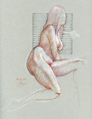
I've been playing around with some of my figure drawings thinking to add some interest, trying to present them as something more than just another nude. Over the years I've often added actual studio backgrounds when time permitted and found I liked the contrast but in this case I want to dispense with realistic context. A new graphic element  helps us see the design possibilities in the figure itself.

The background 'Grid' pushing up against the figure and coming forward in space provides contrast that points up the soft feminine figure and at the same time is an un-natural frame for the figure.


 It emphasizes body contours, negative space and suggests an undefined background, perhaps a window, yet does not perform the function.  So it is in a small way, a mystery.

This is a sparse post and a spare concept - just a start - working with older drawings. I think there are possibilities here.


"Becoming is superior to being." Paul Klee

"I keep very weird hours. I never know when I'm going to have an idea."   Sergio Aragones


Thursday, May 16, 2013

New tree - Color


My original blog idea was to post whatever drawing I'd done each day. While that didn't quite work out, here in that same spirit are a couple of quick pieces done this week.

The sun was warm and bright - first really comfortable day to sit outside this year. In a spur of the moment decision I headed out to draw a huge old maple across the street. Thinking,  "Keep it simple!" I grabbed a nice sheet of gray paper left from some forgotten project plus a couple of pencils and dove into a race with fast changing early evening light. It was fun!

Looking it over later,  I thought the b&w a bit difficult to understand (How about that snow!) so two days later at the same hour tried a color interpretation on another grey. Naturally that bit of "summer" of the previous few days had disappeared! The wind was now blowing madly and so much colder than I thought it would be -  I had to work fast! I tried to capture the 'flash' of sharp sunlight on the new leaves as they fluttered on twigs but still  barely caught what I saw.  I even went back at the end and added some black, trying to boost the contrast but still it doesn't adequately convey the wonderful light of that evening.


Perhaps the darker paper of the first day would have been better! My friend Harry Orlyk, a master of color would have had the answer! He is out there everyday putting oil paint on canvass to produce gorgeous impressions of Washington County farmland. Check his work @ http://harryorlyk.com/

At the top of the page I said I'd set out to draw a tree.  In the end, it wasn't the tree at all!


"In order for the light to shine so brightly, the darkness must be present."   Sir Francis Bacon

"In nature, light creates the color. In the picture, color creates the light." Hans Hofmann

"Art is not about thinking something up. It is the opposite - getting something down,"   Julia Cameron


Thursday, May 9, 2013

Looking at Line: recent nudes


These two recent models, Brittany below and Lauren right, both young women relatively new to me, inspire excellent work. Both have real presence and poise even in simple poses like these, making drawing a real pleasure. But subject is not everything.  Sometimes the things that bring a drawing alive and make the drawing truly interesting, are the lines, the marks themselves.  Following the line and comprehending the form described is pleasure - little to do with the subject.  Its like listening to music or poetry.  Some evoke a mental picture, a place, an action, - but for me most often it's the sound itself that is the joy and here in drawing it's the line.

Here, I started with contour line, added white highlights, then went back and strengthened some lines. Like a poet raising his voice to point up important parts or just emphasizing the ends of lines -  the period at the end of a sentence.


Back in art school (100 years ago!) we were taught that given lines weighty enough, reduction for reproduction would minimize the problems of a line drawing. Some- how seeing these at about a tenth of original size belies that idea. Seems I see parts not important in the original given unintended attention to the detriment of the drawing! Perhaps to see a drawing in a different context has you see things not noticed as you work, something like the practice of holding your work up to a mirror in order to see things you've missed in the doing! Like reading your poetry over out loud to hear the sounds, you have to spend quality time with your work, really looking, following the lines along to feel the flow and get the meaning - the form.


"No object is mysterious. The mystery is in your eye."   Elizabeth Bowen

"Is it not instructive that music can have color and art have rhythm?"    Ian Semple

"Contemplation is the root of awareness and creativity"   Sandra Chantry


Tuesday, April 30, 2013

Archival considerations


Do you remember that great children's story by Margery Williams, The Velveteen Rabbit?  There's a wonderful stuffed toy animal mentioned as having been loved so well that all its hair had been worn off.  In the book you see how the Skin Horse had been worn to a frazzle by thousands of hugs - handled with love so often it was way beyond used - it had become "real"!

My wife's childhood Raggedy Ann wasn't quite that worn when I used it as the subject of this (partial image here) birth commemoration piece, made for a friend's newborn in 1971. I'm not sure where the rag doll is now but that child, a young woman today with a lovely little girl of her own, has kept that "certificate" all these years. She now wants to hang it in her own child's room but it slipped in the frame and she has asked if I would reposition it. Hey, I said, no problem!

Once back in my studio with the illustration unframed, it was obvious there were real problems, some age related but others...!

Just a note here, - a framed work of art on paper is a 'sandwich' consisting of a stiff backing, art work secured to that, a window mat with glass on top, all held in place by the frame. With a traditional wood frame you'd likely glue a layer of paper across the
back to ensure a tight dust free environment for the work.

The frame I'd used forty years ago was high quality aluminum based on the original Robert Kulicke frame made for the Museum of Modern Art in the 1950's. No problem there! And, yes, I had matted the piece to keep it flat, isolated from the glass so that any possible condensation under the glass would not come in contact with the art. All right there too! The big problem was the material of the mat board it self!  It was a common brand I'd used often, as they say, back-in-the-day, but being made from wood pulp it was definitely not acid-free. Gases from this board had acted on the drawing paper, yellowing the surface and could have over time destroyed the piece. In extreme cases professional restoration / de-acidifcation is an excellent and not excessively expensive option.


In this Raggedy Ann case, it's a good thing it had slipped now, allowing an archival reframing, saving it for this little girl and perhaps her own child in the future. I love it!

Replacing the old mat with acid free museum-quality board made from rag pulp will minimize the acid damage. Using acid free tape to secure the artwork in place under the mat is also important. (Check diagram) The adhesives on tapes like masking tape destroy paper. Avoid their use at all cost!  Foam-core backing boards, the most frequently used with metal frames, do have an acid potential but since that is activated by light and are in back of the framed item, this isn't a huge problem. Never use ordinary cardboard anywhere in framing! All in all, use the best materials you can afford in all stages of your production, isolate your work (done of course on acid free paper!) from all destructive materials to ensure longevity. When it comes to final protection good archival framing is the best defense! You may really love your work but you don't want to treat it like the old Skin Horse!

For more details,  http://www.mnhs.org/preserve/conservation/reports/paperframing.pdf


"Every authentic work of art is a gift offered to the future."   Albert Camus

"To remember where you come from is part of where you're going."   Anthony Burgess


Thursday, April 25, 2013

Expressive line


This week's drawings are a real turn around from last week's post. There we had a highly realistic portrait, (Yes, it was a dog!) - done with the help of reference photo's and preliminary sketches. Today we are talking about expressive work, direct drawings that are reactions to the spirit of the moment. They owe more to Egon Schiele or Alice Neel than John Singer Sargent and Rembrandt.  BTW, If you don't know all these artists, look them up, do a Google search or check a site like art.sy where you can find multiple examples of an artist's work and that of related artists.

Here again after a long absence is Kristy, drawn with Prismacolor pencil on Canson 98 lb Pastel paper. (use the back!) I would apologize to her for distorting her features but I'm sure she knows what I wanted in the drawing and it was not photographic realism. Working loosely in this manner - not worrying about a tight rendition - brought happy results as far as I'm concerned! It's a case of stop worrying and start loving your work - relaxing and just enjoying the moment without worrying what your public will say!
- I say, draw!


This second one was done the same day in a similar pose but again with an even freer hand, moving quickly, drawing one line at a time. By setting aside any attempt at actual likeness in both of these we captured her spirit of with a lively line. As usual, slowing down to add a few white high-lights introduces a sense of form more solid than that shown with line alone. If you have been following this blog for any length of time, you know I do like that combination!


"I have spent a lot of years on the outside looking in."  Joseph Barbera

"It is no use doing what you like; you have got to like what you do." Winston Churchill


Thursday, April 18, 2013

Sit!


This good dog's portrait, one I had foresight to scan and print for my commercial portfolio, is my one painted portrait that has worn well over time. I've done several others, drawings that were successful but none had the strength of this acrylic piece. Where the drawings were done from life, this particular painting was done primarily from photographs, an obvious advantage in dealing with a frisky animal but that could be a risky deal for artistic development.

You might think it easiest to copy one good picture directly but real understanding of your subject needs more. First of all, one photo, one view just doesn't do it!  Unless you are intimately familiar with (in this case) a particular type of animal, it is best to take several photos from a variety of angles to provide understanding of general structure and particular characteristics. Even then, unless you have just the right lighting (and the right animal!), photos rarely provide all the information you'll need.  Doing a series of direct sketches as supplement will contribute to your understanding and help you produce work with convincing characteristic qualities. Without complete knowledge it's much too easy to produce dead, flat work rather than the lively portrait you want.

Naturally, whether pet or person, the same principles apply. I did a child's portrait years ago before I came to understand those ideas. While my drafting skills were good,  the poor kid looked much too much a photographer's subject, - almost a snap-shot! You see the flash in the little boy's face and even sense the position of the camera. It's a great picture of a happy little guy but regardless of paint application it still is a photo,  Even when doing realistic work, You don't want to be a slave to reference photos! The lesson?  Know your subject through reference, experience, and observational drawing!


"If one really loves nature, one can find beauty everywhere."   Vincent Van Gogh

"If skill could be gained by watching, every dog would be a butcher."   Turkish proverb


Thursday, April 11, 2013

Ink plus


As I worked to put up last week's post I came across a few additional sketchbook pen pieces I thought might be interesting to discuss.

The little drawing on the left is an offhand doodle in which I played around with two pens, just checking possibilities and testing control. It included some typical snake-y shapes of the period but the rest meant nothing until this funny image grew. I started with an ordinary blue ink ball-point-pen then did some additional work with my Rapidograph #2 fine point.  I liked the dynamic look in the combination of two inks and in later pieces used the two ink idea to more advantage.

The one below, still just a sketch, is a combination of ordinary ball-point pen and, not ink, but #2 pencil.  I love the softness of the gray graphite more and more these days. There's a nice delicacy in it impossible to produce with even very fine pens. 


BTW, The Rapidograph was wonderful for extremely fine work but often needed refilling with its special ink. When it clogged, and that was often, you had to remove the tip with a special wrench, flush it out and when the tip was replaced you really had to work to restart the ink flow. I made some great drawings using a combination of various size nibs but in the end when disposable pens like the Steadtler Pigment liner came along it was just no contest! Aside from the clogging problems and the need to often add ink, the tips wore out and had to be replaced with new nibs, not exactly inexpensive!


This last one is more than just multiple marks. The snake-like cloud shapes above the plane are Rapidograph black ink plus some touches of color pencil. These drawings date back more than 35 years so I think it was early times of my using Prismacolor. It's hard to see here but the plane itself was drawn on a separate sheet, cut out and pasted into the sketchbook page with the clouds, -  collage, I guess!


Speaking of collage,  somewhere in an old portfolio is a very large ink drawing, 30x40 I think, made up of several different parts, all sewn together! To do it, I used high quality heavy rag paper which would support stitches without tearing.  It was very affective and made for an interesting look!

As you can see, there are many ways to approach drawing with ink and certainly at least as many creative ways to combine ink with other media.  It's all Fun Stuff -  So break a leg!


"Collage is the twentieth century's greatest innovation."   Robert Motherwell

"Different is better when it is more effective or more fun."   Timothy Ferriss

"It is our choices that show who we truly are, far more than our abilities."   J. K. Rowling

Thursday, April 4, 2013

Pen stroke


This nude, done several years ago, is shown only partly so that we can zero in on the subject of this weeks blog, the pen stroke and the "artist's hand".
 Working with a fine line Staedler pen I've drawn simple outlines and added hatching to indicate shadow/shading in order to show form.  I've included a close-up so that you can see how little hatching is needed to suggest shadow and form.   You can see how quickly those hatchings were done, one quick line after another in which you see the slight curve in each line because of the wrist action's arc.  Really, it's all in the wrist!


 Sometimes it's not fine art that is the object but a record, a plan, or a nebulous idea that needs to be visualized, - then those hatchings tend to be quicker, less substantial, - just enough to get across the idea of shading or volume .


The jug and antique shears were part of a book illustration idea of a few years ago. You just never know where or how your talents with a pen in hand may be used!


  And .... you can always draw the cat!


"Art is skill; that is the first meaning of the word."   Eric Gill

"The song of the curved line is called happiness."   Rene Crevel


Thursday, March 28, 2013

The Nude as Landscape


I arrived late for the drawing session one time and because the room was full, artists elbow to elbow, I had to take a position off to one side - almost behind the model. In the end this was a good thing. I had an unusual angle. It was actually a simple drawing with all elements of the figure closely related in space with lots of overlapping so it was an easy drawing, easy to compare one part to another.  So easy in fact I had ample time to do two complete, this ink drawing on blue was the second .


This one, pencil on grey paper done more recently, was just as easy for essentially the same reasons. All important elements march back in space like elements of a mountainous landscape - near shapes overlapping further parts. I find that starting in the foreground and working back in space, one shape after another works best. Beginning at the top risks running out of space with near shapes like large feet running off the paper. Starting with near shapes, working back,  the laws of perspective are more easily seen. Look at the mattress and how it narrows as it recedes. The body does the same. Hnm, perhaps the feet here really should have been bigger!


"To be an Artist you must learn the laws of nature."    Pierre-Auguste Renoir

"The last thing one discovers in composing a work is what to put first."   Blaise Pascal

"What a delightful thing this perspective is!"   Paolo Uccello


Thursday, March 21, 2013

"The only rule is work"


The title of this blog post is major maxim #7 by Sister Corita Kent who's wonderful graphic work is currently on view at the Tang museum.

This great exhibit presents dozens of her delightful serigraphs (silk screen prints) covering her artistic life from the late forties up to her death in 1986.


Rather than describing this show with personal interpretations, let me just say I left that print filled gallery with a huge happy smile, spent a few minutes in another gallery space but returned to those delightful prints for more! Along with the  joy of her color and heart felt text, we also gain insight to her practical creativity. In a time long before the magic of Photo Shop,  Corita Kent developed a simple way to manipulate and distort type to produce dynamic works. If you have any interest at all in graphic design, typography, pop-art, poetry, color,  or just plain 'good art'  -  "Someday is Now" is the show title and I say get yourself to the Tang at Skidmore College in Saratoga Springs, NY and See It Now!


The Exhibit opens later this year at the Cleveland Museum of Contemporary Art in June and  Pittsburg's Andy Warhol Museum next January. If none of these venues works for you, the link below provided by the Tang will allow you some general views of the show but believe me, it's a sorry substitute to being there. <http://tang.skidmore.edu/index.php/posts/view/768/>


"Damn everything but the circus."    Corita Kent


Thursday, March 14, 2013

Drawing, Design and the Nude


I spoke last week of the benefits of play.
Taking time to relax and get away from the rigors of a tough job or a bad situation is always a good thing. In art it is especially beneficial!  In last week's blog post I spoke about the insights to be gained in diverting from your normal approach by "adjusting" a failed piece, playing around with it just to see where it might lead.

In drawing the human figure I've often wondered what ways I might set the figure apart from the background or integrate it into the background. Playing around in various ways I've explored ideas like multiplying background elements as in the red toned portrait on the left or adding a simple rectangle as in this blue nude where the geometric shape is cool contrast to the organic form of the female figure. In each of these color pieces the light figure stands out from a darker ground pointing up it's importance.

Taking these ideas a step or two further, we might convert a sketch to a finished design like this B&W piece.  Simplifying the figure, treating it as a graphic element rather than a particular person makes it useful in any number of applications. I recall thinking this would work well as a wood-cut.   Don't you think?


"The anatomy of a picture is more important than the anatomy of the subject."   Marc Awodey

"A sculptor is a person who is interested in the shape of things, a poet in words, a musician in sound."
  Henry Moore

"The abilities to draw and paint are slaves to good design."   David Rankin


Friday, March 8, 2013

Fun Time!

 Every once in a while, looking back through old sketchbooks I find works which were never really meant to see the light of day. Pieces that, because the originals hadn't been particularly noteworthy had invited playful alterations. How could I resist?  Being poor work already I might have even made improvements! Looking at the male figure on the left, I saw awkward drawing, poor composition and a lot of empty space. The addition of a "twin" figure introduced "repetition" a solid principle of design. Adding massed background detail to set off the simple figures uses another design principle, "contrast". Both together helped make it a more interesting, more complete composition.


There's more to it than that. It's the basic creative urge that most artists share, the impulse to make something from nothing! The need to produce unique work, interesting not because it reproduces reality (a noble aim) but because it is just plain FUN! Playful engagement is the road to the new idea, new concept, new process -  in a word -  growth!


The works shown were fun but more than mere doodles, they were visual problem solving exercises. Faced with virtual disaster you are free to play around and to treat failures as opportunity. Not necessarily the opportunity to turn trash into treasure but a chance to learn.  It's like that early TV children's artist who would invite kids to scribble a line or two that he would turn into a funny cartoon drawing. - but looking carefully, gaining insight as you work. If in the end it's still a piece of trash you would have learned something there too!

Yes, I have to admit the fun ran away with me in that second piece. It became an over-done doodle but that's OK. It reenforced one other important concept, one tough to learn - knowing when to stop!

So, don't be too quick to toss bad works!. They are opportunities to push off in new directions, like taking a never traveled back road instead of a mundane highway and finding an architectural gem.  As the NY State Lottery motto says,  Hey - you never know!


"Creativity is not a talent; it's a way of operating."   John Cleese

"The essential ingredient for creativity is wasting time."   Anonymous  


Thursday, February 28, 2013

Just a Few Ladies !

I don't have any profound words for this weeks blog post, a collection of both recent and older drawings. I'll not tell you which is old or new but let you decide based on knowledge you've gained following the blog. You can see a loose linear way of working, a look at figure construction and a particularly tight hard-edge piece which may be related in time to a "Big Foot" post of two years ago. You decide!  Scanning the page, I really respond most positively to the (almost) black & white drawing below.  The more colorful hard edged piece is just that, - hard!  It's tight, highly controlled and a much more finished piece than the young lady in braids.  Looking more finished might cause us to see it as more important, more likely deserving treatment as a major piece - a wall sized painting perhaps but it wasn't really finished when I ran out of time with the model. I would have given those feet the attention given the upper body (and did so in a similar piece of the same evening) but now I'm happy with it as is. That bit of (foot) looseness helps it relate to the other two figures on the page as all three feature unfinished feet! 

These two were actually done within a few weeks of each other but still they are quite separate in approach.  For the most part I view my figure drawings as exploration and self education so continually vary technique as I work.   The small spare figure was all about construction and proportion while the larger one (left) is much more an illustration, a study of personality and setting which could have been developed further had I really thought about it.
I've put them all here as contrast to the much more realistic "14 inch Red" pipe wrench of last week and the grittier "Dan by Window Light" of a few of weeks earlier. Don't forget, you can scroll back through almost three years of this blog to see the range of my drawing interests.  Every-once-in-a-while I do that and surprise myself with forgotten pieces!


"Specialization is for insects."   Robert A. Heinlein

"Blessed are the flexible, for they shall not be bent out of shape."  Anonymous


Thursday, February 21, 2013

Tools of the Trade


A good friend recently did some repair work for me, things I just cannot handle myself. While a simple "thank you" might be sufficient at such times, I like to make it particularly personal. A nice home-made thank you note, pointing out his ease with tools would be the ticket, so I started sketching a collection of  hand-tools. None of those tools I drew were really saying the "Thank you!"  I thought they should so I started another, a good sized pipe-wrench , quite appropriate in this case.

The plan was a tri-fold card expressing my thanks for his expertise and quick work. Unfortunately the drawing got away from me, took on a life of iit's own, became more than card material, too well done to be folded, stuffed into an envelope and delivered by the postal service!  It's now nicely framed, hung in a proud place in his home and officially documented in my notes as Finished Drawing - "Red Fuller 14".  Naturally it does not fit my scanner so we have to be satisfied with this partial picture.

Oh, yes - I did mention the "D" word!  Documentation is an important word, but in our artists' world rarely acknowledged aloud.  A good record of your major work is essential if you and eventually (shudder!) your estate, are to maintain control of your works. If you have ever watched the popular TV show, "Antiques Roadshow" you will have heard the experts praising the collector who can prove provenance when asking for authentication or value.  My records show finish dates. titles, media and size, plus sales or auction figures with buyers names when possible. Someday someone will be gathering your work for exhibition and good records will help find owners.  Just imagine that future big museum/gallery retrospective with your works gathered from around the world, displayed for all to admire! Step aside Picasso!


"It's not our art, but our heart that's on display."   Gary Holland

"Lots of folks confuse bad management with destiny."   Frank Hubbard

"If you want an accounting of your worth, count your friends."   Merry Browne

Thursday, February 14, 2013

Seeing Double


These two male nudes are, as you can see, two versions of the same standing pose from different viewpoints. Doing two versions of almost any piece is much more instructive than one. Even in finished work, like major pieces part of  long series, later pieces benefit from the repetition. Here you can see that the second drawing is a bit better.  The intense re-contemplation of problems, be they anatomy, design, color or execution, will be more positive in that double dose of work.


Rendering the light on the torso  shows the bulk and structure of the body and helps us understand the relationship of one part to another without relying on line to define the various elements. (and that requires really looking!)


These first two images are a bit on the light side but that was also true in the originals, but who says a drawing must be strong, with tons of contrast?  There are times when a light hand is just the right touch!


If you see a little glow of yellow around the upper left figure, it isn't your eyes. It is actually there.  - I believe it was an attempt to increase the contrast between figure and ground.  A cool color like blue might have been better, don't you think?

Along those lines, here is another male nude in which blue was used, not for contrast in the final but as the initial sketch. Using a different color as underdrawing is a good way to construct the figure, make your "mistakes" without having the marks read as finished.  The use of a contrasting color like the blue, keeps the two separate as you work out problems.  It does another thing. It pulls your audience into the work by giving them clues to your methods, involving them more fully in the process.

BTW, remember, the Prismacolor pencils that I favor don't erase well, so you either "Just go for it!", putting down final marks right at the start or you find a way to build your drawing in a way that allows you reasonable control.


"Don't cater to the audience. Inspire the audience."   Ken Darby

"Give yourself room to fail and fight like hell to achieve."   Irwin Greenberg

"Art that serves an artist best is an experiment in expanding awareness."   Peter London

Thursday, February 7, 2013

Lauren


A good day became a very good evening early this week! For the first time in 2 1/2 years, I was able to participate with the weekly figure drawing group. Lauren was the model and we had her seated with arms supported, wound with long scarves hung from the ceiling.  A nice pose!

I was more interested in the figure than the fabric so I just left that out. I drew more quickly than I would have in the past, wanting to get an over-all understanding of the pose before settling down. I actually did three drawings, each a bit more lengthy than the last.  First a forgettable 15 min sketch,  a second one taking 40 minutes and I think the last (here right) must have been about an hour. Now I'd like to go back and do one more, a carefully rendered three hour job,  carefully measuring to get the proportions more correct. (I know! There I go contradicting myself again!)


Here on the left is a similar drawing done a few years ago. It's one that I really don't like as much but has better body proportions. Yes, the model above is much thinner but that does not account for the overly generous space between chin and mid breast. Typically that space is approximately one "head" so there's certainly some exaggeration there.  Still, I prefer that looser drawing because being less complete, it is more interesting. I was so diligent with features like the hair in this second piece, being so precise, that it is, as the old saying goes,  "... more prose than poetry."

Leaving out areas of her body involves the viewer, letting him contribute in imagination, making it a more engrossing piece. - At least that's the way it works for me.  It's much like Dan in his baker's duds in the previous post, there's more room for creativity with the distinction between subject and background in flux.  But then again, as with so many artists, we often prefer more recent work to the old, so it could be just plain bias! (Hmm, Age discrimination?)  In the end it's your work, deal with it as you will but do it with love and purpose and you will always be happy to own it!


"So the darkness shall be the light, and the stillness the dancing."   T. S. Eliot

"It is love alone that gives worth to all things."  Saint Teresa of Avila


Thursday, January 31, 2013

Variations


If this page looks familiar, it's because it was posted for a couple of hours by mistake just last week.  Sorry!

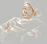
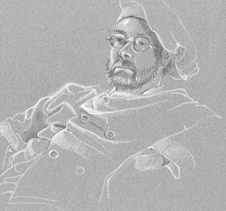
I think I've mentioned the fact that my drawing group has had relatively few men as models but Dan was one who was frequently on the stand several years ago. I show these particular drawings to point out a couple of ways to use white pencil on toned paper and to explore some subsequent creative moves. In most of my drawings where white pencil is involved I've worked with contour line then added white lights. These two are a bit different.

In this first informal portrait sketch the white is used as  reflected light that defines the smooth shiny skin of his forehead and gives us an overall sense of three dimensional form.  This in turn contributes to our comprehension of the figure as "real", standing out from an indeterminate background and acts as evidence of something just out of sight - perhaps light from a window - a contribution to atmosphere or story.


The second drawing is a bit more abstract, more graphic. The over-all "feel" of the picture is softer, more laid-back than the portrait above with its black bristly beard. The white still illuminates the forms involved but rather than necessarily being realistic  we see it more as shape and edge with the grey toned paper doing double duty as background and mid-tone skin and fabric. If we were designing something like a serigraph, a silk-screen print in which color would typically be flat without gradation, this drawing could serve as an initial step. In such a print it could lose some of its soft delicacy but the tension of background vs. foreground would still work.


Here are a couple of variations via Photo Shop: one on the left with increased color saturation, a second with high contrast,  the third with all color removed - just black & white (really grey) variations so softer still.  I could go on with a dozen iterations but suffice to say it's a good way to test the "what if" question before actually doing a second color drawing, painting or for actual use in making a print.


Now, having said all that I realize we are going in a direction that violates or at least bends one of my first principles, the concept of art - drawing in particular -  as hand-made.  You know I always speak of the hand of the artist as an important aspect obvious in the work but once you cross over into reproduction, whether mechanical, photographic or digital - that may not apply at all.
Think about that!


"There is no best way to make art, but there are a lot of better ways."  Darby Bannard

"Art and science have their meeting point in method."   Edward G. Bulwer-Lytton

"The abstract nature of reality is the source of beauty."   William De Raymond


Friday, January 25, 2013

Perspective!

One of the great things about doing this blog through Google's Blogger are the up-to-date statistics provided that help me manage this effort. One bit of information I love shows my viewers' countries.  Nice to know! Another tells me what search words were used to access the blog posts so particular interests are obvious. Lately I've seen many hits around the subject of perspective and since I've not shown any pertinent pieces here in many months, here is one with some comments and explanations. I published the painting below more than a year ago when I wrote about color, light and reflections. I show it this time because it is a good example of a couple of basic perspective ideas.

The most basic idea in perspective is the concept of overlapping shapes. -  an object overlapping another is closer.  Picture two squares of cardboard, one overlapping the other.  Starting with the group of trees and bushes on the right edge of the painting below, you can see a series of overlapping planes, like stage scenery moving back toward the far sky. Trees, then bushes, next a house and another, a stand of dark trees, etc.  Simple, right?


Another important concept is aerial perspective, - the fact that atmosphere interferes with light transmission so that the further back in space, the less distinct are objects and their colors. You can see this most obviously on hazy or foggy days.  If you were making a painting or illustration, working in the studio rather than observing a scene, you'd plan stronger, brighter and/or warmer colors forward,  with cool hazy dull colors toward the rear.  Compare the far steeple and trees with colors closer in this view. 


When people speak of perspective they generally mean one or two-point linear perspective.  In this painting we can see that things like the retaining wall and the creek bed both recede in an orderly way, getting smaller as they move back from the picture plane (basically the painting's surface) toward a point on the horizon.  The basic rule says, lines parallel to each other and parallel to the ground run toward a common "vanishing point" on the horizon.

Think of the far horizon on the western plains or the ocean, not the place where sky meets a mountain.  In a picture like this that horizon is obscured by trees, houses and hills so think of the horizon as your eye level.  It is! The painter's eye level in this case would be a horizontal line across the picture just below the top rail of the bridge. In the painting you can see a white rectangular trash bin.  It sits parallel to the wall and creek. If you drew lines along the top and bottom of that box front, and the top and bottom of the wall and the sides of the creek -  and extended them back in space, all would run toward the same vanishing point.

BTW, the term "one-point perspective" refers to the common vanishing point for parallel lines, not that there is only one vanishing point in the picture!  Various objects  sitting at different angles would result in a variety of vanishing points.  We can address that topic another time when we talk about 2-point perspective.  In one-point perspective other parallel lines like those of the bridge and the walls of houses facing us are always drawn parallel to the picture plane.

So....  Colors fade with distance! The horizon line is your eye level!  Parallel lines run toward the same vanishing point!  Got it?


"Perspective should be learned - then forgotten!"   Nathan Goldstein


Tuesday, January 22, 2013

Flemish dress drapery

Just a quick extra post this week!  I came across this drawing of a young Flemish woman modeling a lovely dress for us.  If you think back to last week's post I talked about the problems of understanding folds in the drapery of clothing.  In that post I recommended exercises like dropping cloth or crumpled paper on your desk then copying / comparing  the creases and folds you see.


I swear this Flemish artist did exactly that but then he added the woman's figure as if that cloth drape were her dress!  Doesn't it look like that to you?  I used to draw lightly crumpled paper then turn it into a craggy landscape with added trees and more carefully defined rocky cliffs.  That worked for me and I'll bet it worked for him!


(Kneeling Lady, School of Hugo van der Goes, 15th century)


Thursday, January 17, 2013

Rembrandt and Crumpled Paper


Here's a lovely little Rembrandt drawing! Look at how beautifully this woman's clothing fits her body. Check the drapery of the skirt falling so convincingly from her waist.  See how her bonnet really fits on her head!

Now, let me revise those words just a bit. -- Look how Rembrandt shows you the body's form so beautifully. - how he renders so convincing the drapery of her skirt, - how that bit of shadow he added on her bonnet shows us the cylindrical form, even hinting at the bulk of hair beneath.  I'm just pointing out the fact that there's a person, an artist doing the "showing"!  A person who at some point in his life couldn't draw that well!

I'm stating the obvious when I say Rembrandt was an absolute master!  When not working on commissioned paintings he spent hours drawing the people around him or just as likely sat alone drawing his own face by candlelight. He drew constantly!


Here is a section of a drawing where I worked to reproduce the folds and creases of the model's shirt. Aside from the fact that I am no Rembrandt, one reason those folds don't have the strong three dimensional qualities his do is the lack of light and shade, his trademark in his drawings and  paintings. There is some sense of form in mine because those carefully recorded lines describe over-lapping shapes but compared with his, these drawings still seem a bit flat.  (I almost said, "fall flat" but I don't want you to think I reject these drawings.  I like working with line. I value that simple aesthetic.)

You can see another thing going on when you compare  with the grey cloth drawing below.  I copied as closely as possible the edges and folds of the shirt's fabric  and while I did a somewhat similar thing with the lines of the grey cloth, I added both lights and darks on the mid-toned paper.  This expanded rendition gives us a lot more visual information so we comprehend the form much more easily.


I've zeroed in on folds and creases  here because it's one problem we often face as we draw people. Yes, if you look at clothing carefully you can interpret wrinkles fairly well but as with human anatomy, it helps to understand the anatomy of draped fabrics. Toss a piece of clothing over a sharpe edged object and look at the way it settles itself. Drape it in various ways. Do it again and notice the similarities in the folds from one "toss" to the next. Try different fabrics, heavy and light, then make comparisons. Do some sketches. Do some more!


Another quick exercise is to very lightly crumple a piece of paper and draw it in different views. Crush a few more sheets: one lightly wrinkled, another more heavily. Crush one then unfold and gently flatten it. Draw these using your favorite medium but don't be afraid to try different ones like hard & soft pencils. conte crayon, charcoal, - even pen plus ink wash as our good mentor, Rembrandt, did above but really, --  Just draw!


"Aim high and you won't shoot your foot off!"   Phyllis Diller

"There is only one proof of ability - action!"   Marie von Ebner-Eschenbach


Thursday, January 10, 2013

Give her a hand!


This nude done several years ago, is one I really love! It has great color, an almost tangible sense of three dimensional form and a very real personality there in the model! When I found it in an old portfolio just now I wondered why I hadn't used it here it in the past.  Checking back, I did find that I'd done a post with what I believe is same model but in a completely different pose, - not this drawing.  So, what's not to like?

It didn't take long to find the problem and I'm sure you've found it just as quickly! Her lips, breasts, knees and even her nose has that strong form I just spoke of.  The feet, even though lightly outlined, are acceptable because we understand them to be barely sketched in place.  They "read" well!  No, it's that wimpy hand! The right hand is bad enough, hanging like a limp fish with little delineation but look at that poor left hand. What a disaster!
Hands are not just a problem here but a very real and common problem that frustrates many an aspiring artist!


Hands are probably the most difficult part of the human body to draw convincingly because they are so articulated and flexible.  This difficulty is especially true when, as in the left hand above, the distortion of foreshortening is involved.  I remember fighting with it, trying to make myself believe it was a solid live hand rather than a flat and empty glove. At the time I just couldn't see it any differently.


I often redraw details of pictures when I have problems. I was doing a pencil portrait of my aged mother when I realized my rendition of her hands was not working well at all. I did these additional sketches  trying to understand the particular characteristics of her hands - the enlarged knuckles in crooked fingers for example.  This is one of those instances where some knowledge and prior practice would be useful!  It's really back to the books time!


I've often had students who thought it my duty to teach them "how-to-draw" what ever their current interest was whether cat, dog, horse, super hero, or anything.  If you have been following this blog for any length of time you know my emphasis has always been observation, "learning to see",  so what-ever your particular subject, even something unfamiliar, you'd have some success in drawing it.  Beyond that, research is the answer.  When confronted by a problem like the hands above, check out a basic artists' anatomy for realistic depictions of bone, muscle and ligature relationships then go to a good "how to" volume for diagramatic construction tips.  Between those actions and some quality observation,  you should be (and I should have been) able to draw an observed hand in any position.  (Still, that foreshortening can be tough!)

Yes, if you have a particular interest, do some real research, get to be the expert so that your work is understandable, unified, interesting to look at and interesting to do. I often talk here about the importance of observation and at times even preach acceptance of distortion in your drawings BUT context is important!  The whole drawing, the whole figure in this case, should meet the same basic standards and the drawing of the lovely model above clearly misses the mark in that left hand.  Mea Culpa!


"Difficulties come not to obstruct, but to instruct."   Brian Tracy

"When I see nature I see it ready-made, completely written - but then, try to do it!"   Claude Monet